portfolio
Full-cycle
launch website for
win crypto
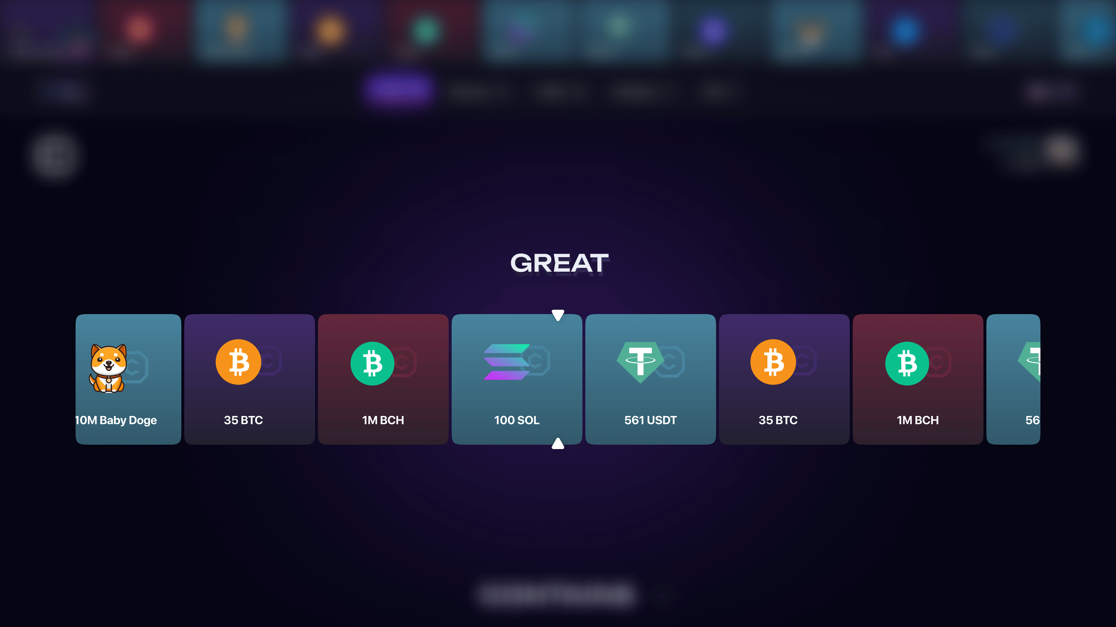
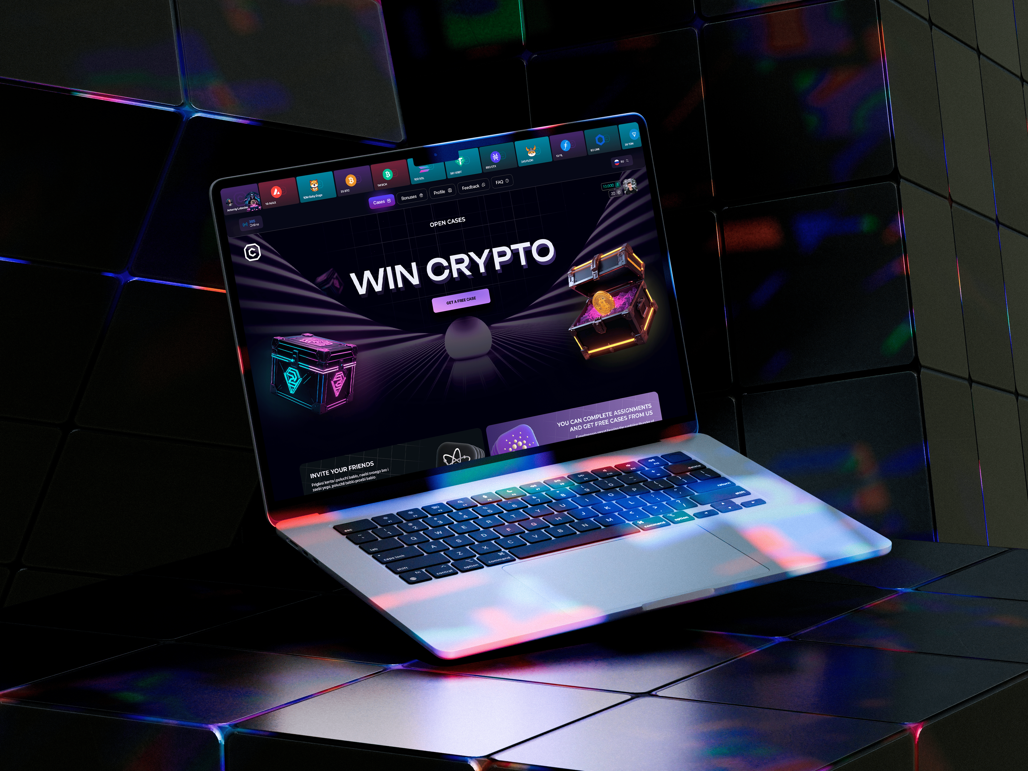
/ For a crypto product, the visual style has to carry emotion without collapsing into chaos. We built a promo page with dense neon contrast, a clear hierarchy of offers, and an interface that feels like a confident product launch rather than a noisy template.
problems
Challenges We
Faced

Skepticism barrier
/ The crypto niche loses trust quickly when the visual language feels cheap or chaotic. That is why we made the presentation more composed, more technological, and more convincing from the first contact.
High-noise space
/ On a launch page, it is easy to overuse effects and lose product clarity. We kept the neon energy, but made every screen obey a clear grid and hierarchy.
Conversion clarity
/ The user has to understand quickly what the product is and why it is worth staying on the page. That is why the offers, benefits, and CTAs are assembled into a direct and confident route.
Design
/ concept
Neon without visual clutter
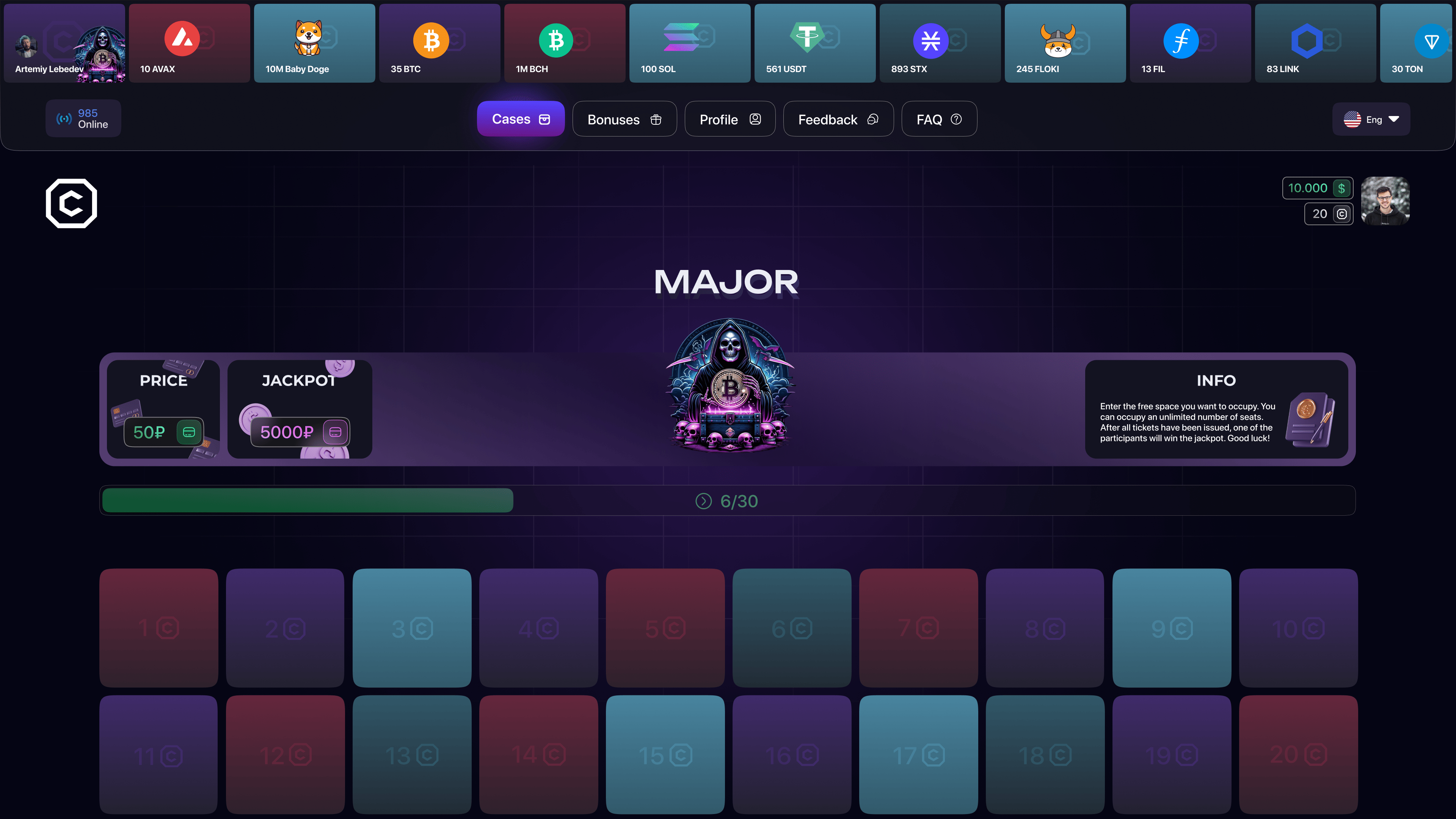
> The project needed the energy of a launch, but without cheap aggression. That is why we built a deep dark scene, controlled glow, and clear product-screen blocks instead of chaotic effects.
/ ui logic
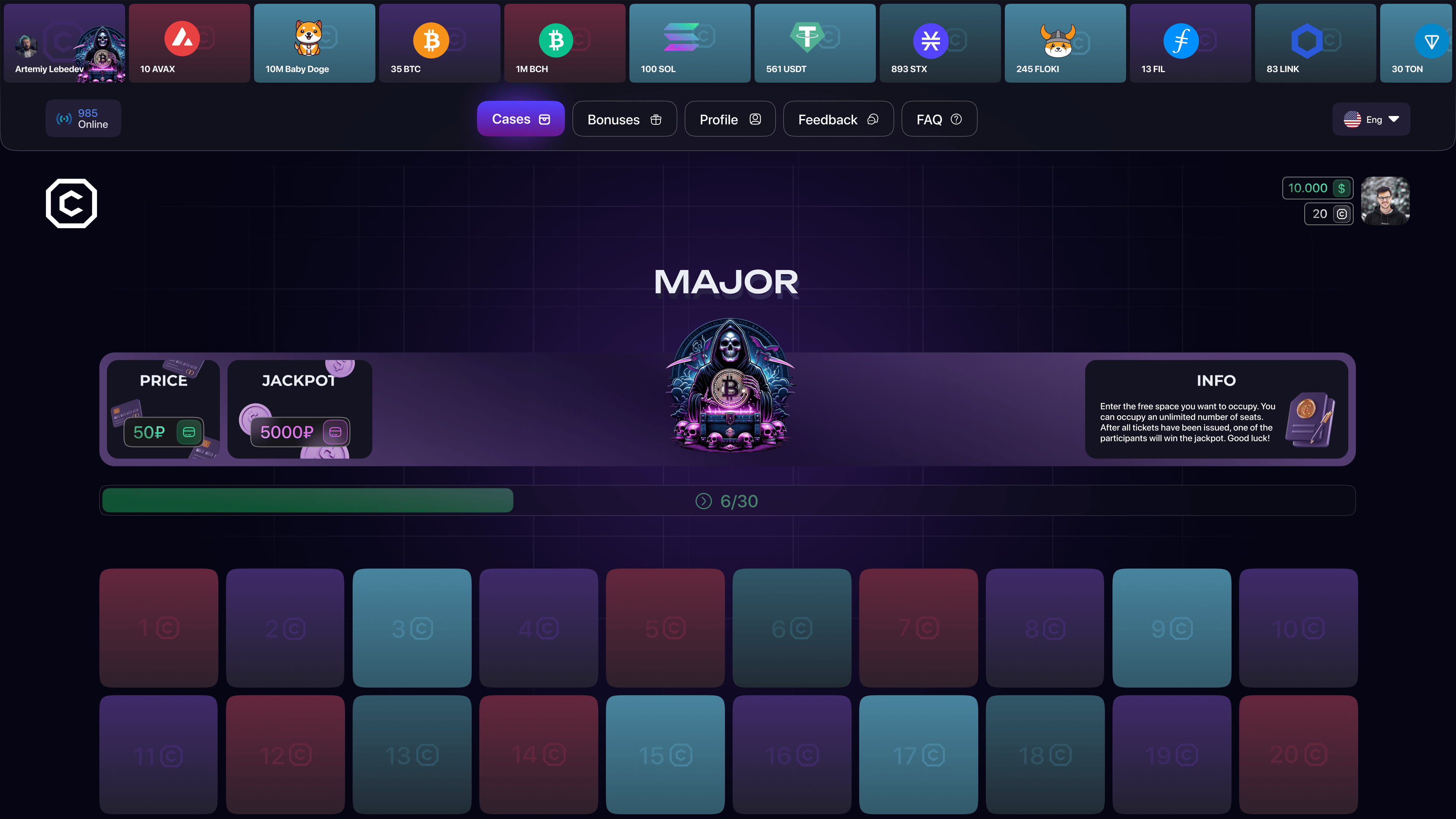
The product stays in focus
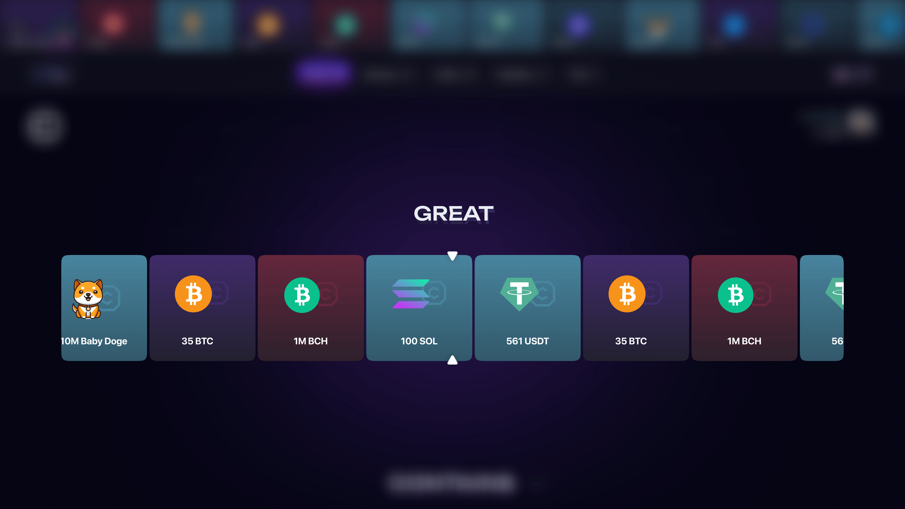
> Every accent works to showcase the interface rather than compete with it. That is why the pages do not just look striking, they actually lead attention to the product.
/ result
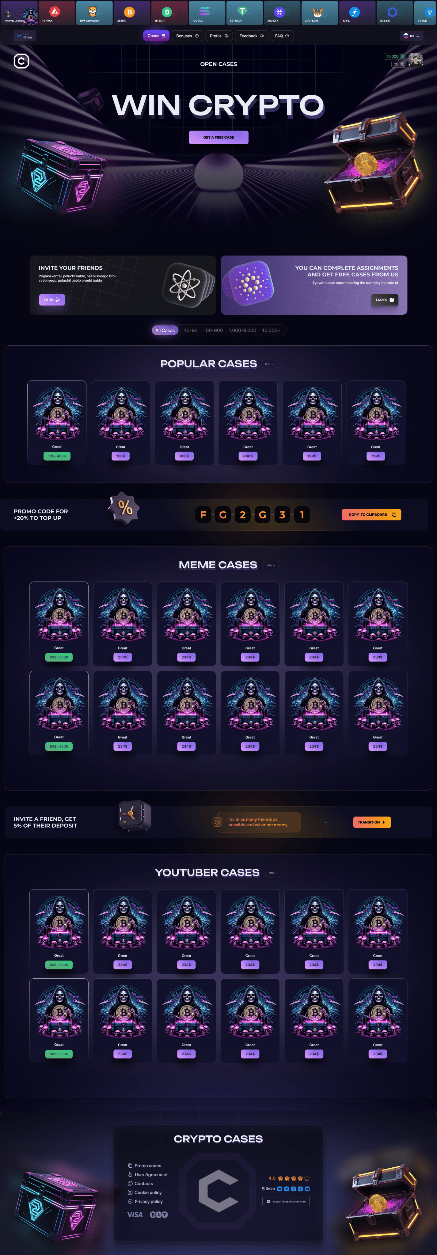
A launch system, not a set of banners
> One visual code holds together the hero, feature modules, and product shots. Because of that, the project reads as a coherent technological platform rather than a set of random promo screens.
palette
Color palette
/ The palette is built on a deep dark base where bright violet accents feel composed and technological rather than playful. It gives the project the right level of energy without losing control.
/ Light neon tones work as focus points inside the dark scene and help the interface keep its depth. That makes the product feel modern and memorable from the start.
01 / Plum base
02 / Deep indigo
03 / Neon violet
04 / Night blue
typography
Fonts
Poppins

Headlines
Meet Poppins - a clean, geometric sans-serif
Body text
It combines simplicity with a touch of warmth. Readable on screens, elegant in print.
Every letter feels balanced, modern, and friendly.
Poppins
Headlines
Meet Poppins - a calm, confident type system
Body text
It supports dense information without becoming heavy. That is why it works for legal content and long-form case pages.
Every letter feels balanced, modern, and friendly.
Poppins
Headlines
Meet Poppins - a clean, geometric sans-serif
Body text
Readable on screens, restrained in tone and stable in long sections. It helps the layout feel consistent from hero to footer.
Every letter feels balanced, modern, and friendly.
Let's discuss your project
We can improve your website so it becomes more attractive, easier to use, and more effective for business. Leave your details and let's build something strong together.