portfolio
Full-cycle
mobile app for
social fashion
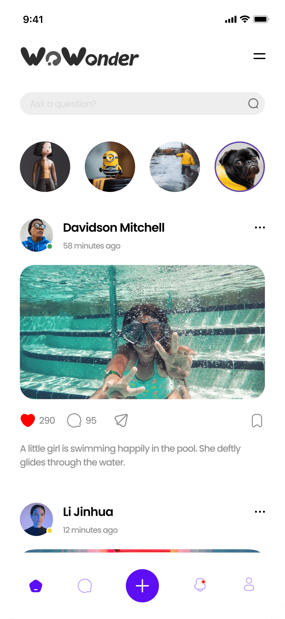
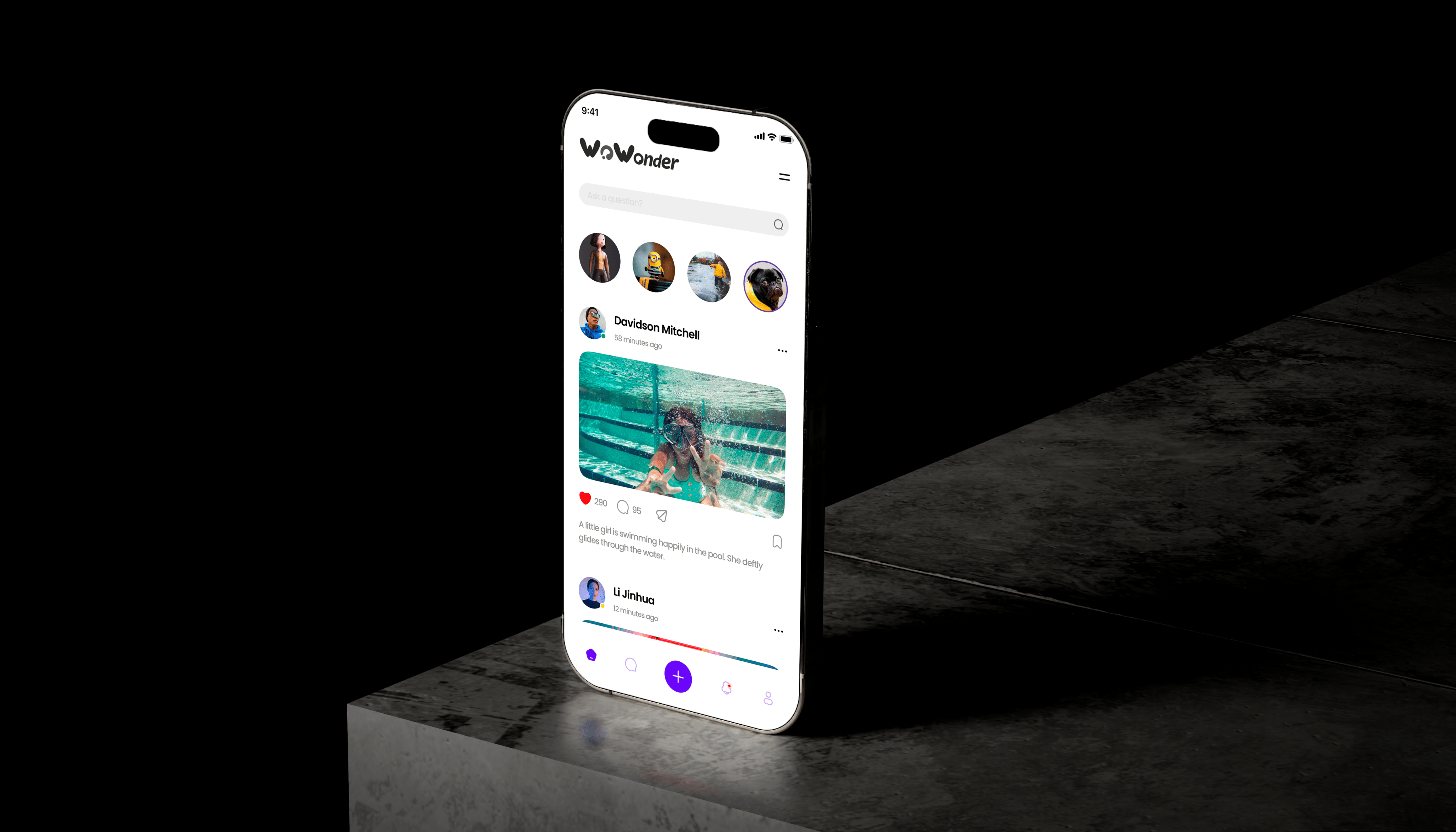
/ For a social-first app, it is crucial to keep a balance between a vivid presentation and an easy browsing flow. We built the interface around content, vertical user habits, and clear navigation so the feed and interactions would feel light.
problems
Challenges We
Faced

Social-first focus
/ In a social product, the interface cannot compete with the content. The visual system therefore had to support photos, the feed, and reactions rather than pull attention away from them.
Content hierarchy
/ When there are many cards, profiles, and media elements, the user gets lost quickly. We built the logic so the key content reads instantly and does not scatter across the screen.
Retention loop
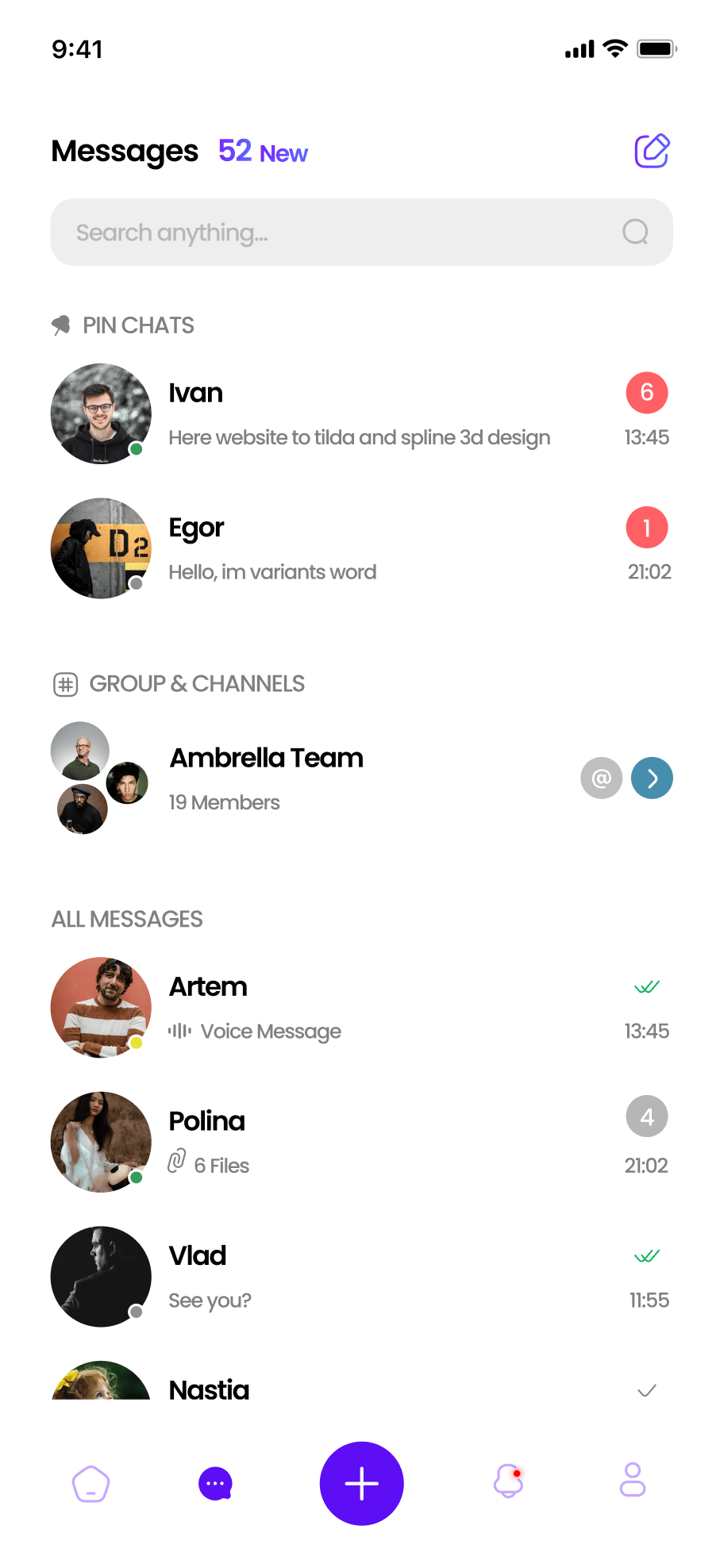
/ What matters is not only the first view, but also the reason to return. That is why the cards, feed, and communication flows are designed to create engagement without unnecessary complexity.
Design
/ concept
Content as the lead character
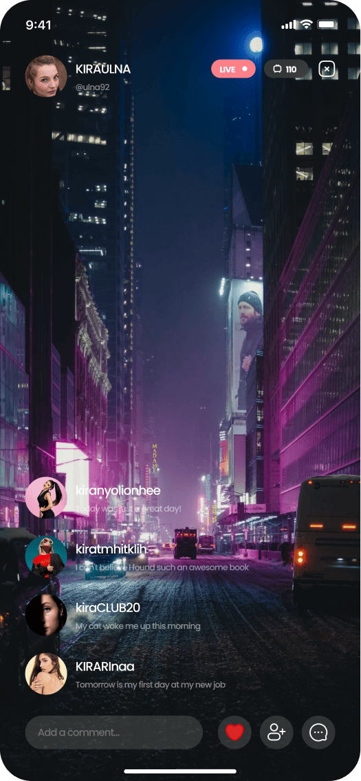
> We chose a format where media content and the feed feel lively while staying controlled. The dark base gives the screen more depth, while bright violet accents add recognizability.
/ ui logic
A vertical rhythm of interaction
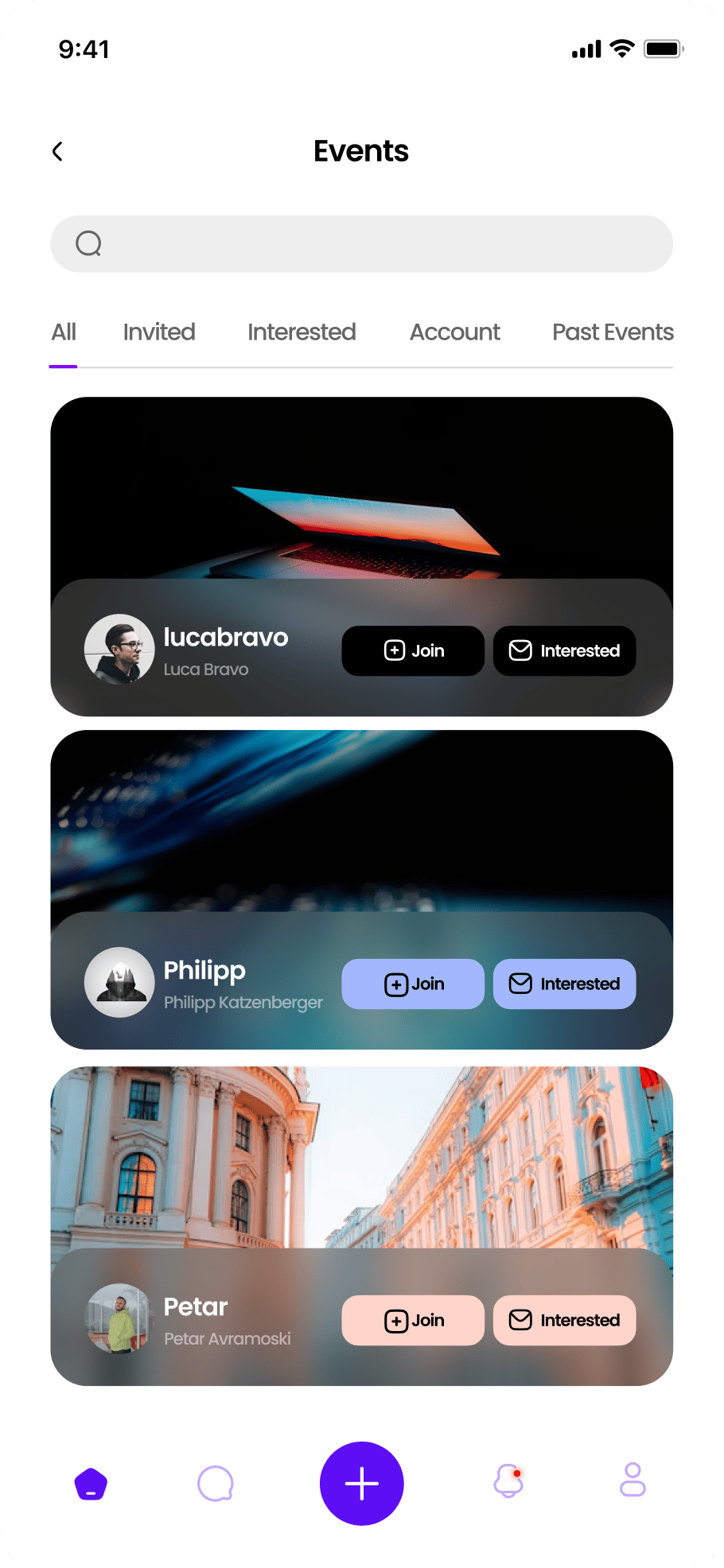
> The screen is designed for the habit of quick scrolling, instant card reading, and intuitive decisions. That is why all modules follow a familiar mobile rhythm without overload from minor details.
/ result
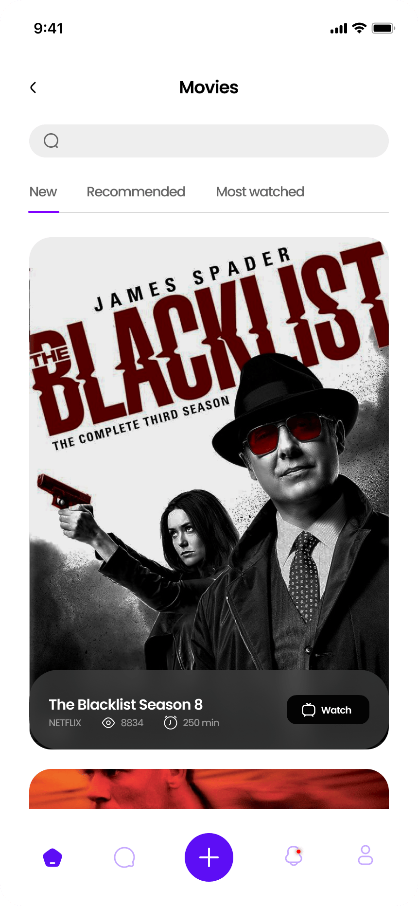
Modularity for growth
> From the feed to product cards and community screens, everything is built from one set of patterns. That is why the app does not fall apart when new flows are added and remains coherent.
palette
Color palette
/ The dark base helps media content feel deeper and makes the interface more noticeable in a mobile format. Violet accents build the brand character and keep the app from feeling anonymous.
/ Light cool tones work as separators and help maintain visual cleanliness even when the amount of content and cards increases.
01 / Soft white
02 / Mist gray
03 / Electric violet
04 / Soft lilac
typography
Fonts
Poppins

Headlines
Meet Poppins - a clean, geometric sans-serif
Body text
It combines simplicity with a touch of warmth. Readable on screens, elegant in print.
Every letter feels balanced, modern, and friendly.
Poppins
Headlines
Meet Poppins - a calm, confident type system
Body text
It supports dense information without becoming heavy. That is why it works for legal content and long-form case pages.
Every letter feels balanced, modern, and friendly.
Poppins
Headlines
Meet Poppins - a clean, geometric sans-serif
Body text
Readable on screens, restrained in tone and stable in long sections. It helps the layout feel consistent from hero to footer.
Every letter feels balanced, modern, and friendly.
Let's discuss your project
We can improve your website so it becomes more attractive, easier to use, and more effective for business. Leave your details and let's build something strong together.