portfolio
Full-cycle
website for
a law firm
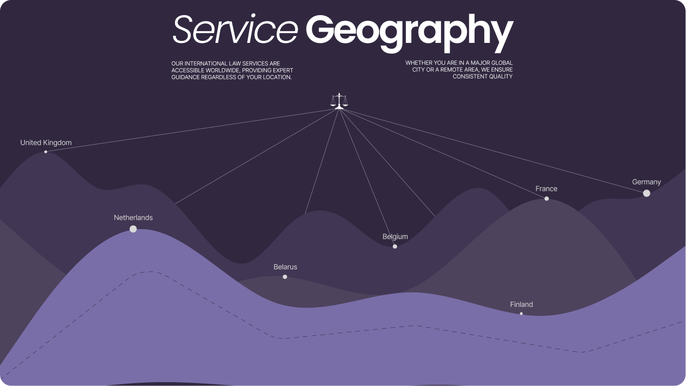
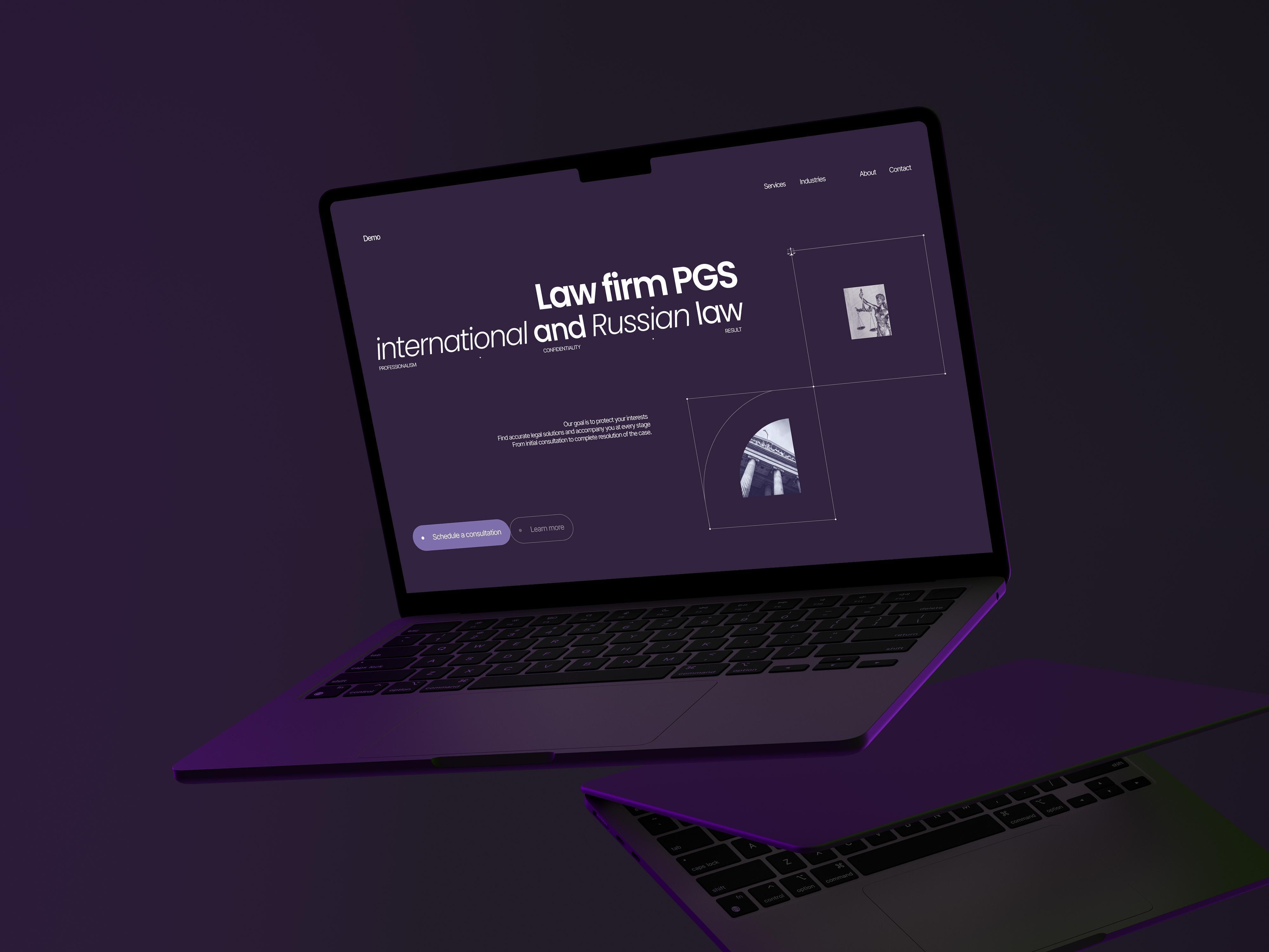
/ PGS Associates is a team of international lawyers with a core practice in cross-border law and asset recovery from abroad. The website was created from scratch: we had to build a digital presence that explained complex expertise, introduced the rest of the firm's practice areas, and quickly conveyed the level of the team.
problems
Challenges We
Faced

No market references
/ The legal niche, especially on the local market, often looks outdated. We had to dig deep into the context and shape the solution with almost no strong references to build on.
Scalable architecture
/ The site had to work as a foundation for future growth: new practice areas, pages, and scenarios needed to be added without expensive redevelopment. That saves development budget from day one.
Complex decisions
/ The user had to understand where to go without effort. That is why each scenario and screen was reduced to a direct, confident route.
Design
/ concept
Client brief and visual direction
> The client wanted a website that felt strict but not lifeless, and made one requirement clear from the start: purple had to become the visual foundation. It is a difficult color, so we spent time finding the right balance and ended up with a tone that feels premium rather than decorative.
/ ui logic
The right rhythm and delivery
> We built the interface through the contrast of dark blocks, calm typography, thin lines, and an unusual module grid. That rhythm holds attention, adds a more premium character, and keeps the site from feeling generic.
/ result
A system instead of isolated screens
> Every module continues the one before it: the same spacing, radii, contrast, and rhythm create a unified system. That is what makes the page convincing on every screen.
palette
Color palette
/ Purple became more than an accent. It became part of the brand character. We pushed it into a deeper, more restrained range so the site stayed serious while clearly standing apart from typical legal websites.
/ Light and smoky tones balance the darker sections: they remove visual heaviness, support the typography, and help the whole system stay coherent across long pages and future extensions.
01 / Deep plum
02 / Smoke violet
03 / Royal accent
04 / Soft lilac
typography
Fonts
Poppins

Headlines
Poppins gives the headlines control, shape and presence.
Usage
We used it in large statements where the site needed status, rhythm and a more expressive voice.
It became the accent layer of the whole visual system.
Inter Tight
Main text
Inter Tight keeps long legal copy readable and stable.
Usage
As the main typeface, it handles dense content calmly and keeps the interface clear from the hero to the footer.
This is the base layer of the whole reading experience.
Poppins / Inter Tight
Pairing
Together they build hierarchy without visual noise.
Result
Poppins carries the emphasis, Inter Tight holds the structure. The pair makes the site feel premium, modern and precise.
That contrast gave the project character without losing discipline.
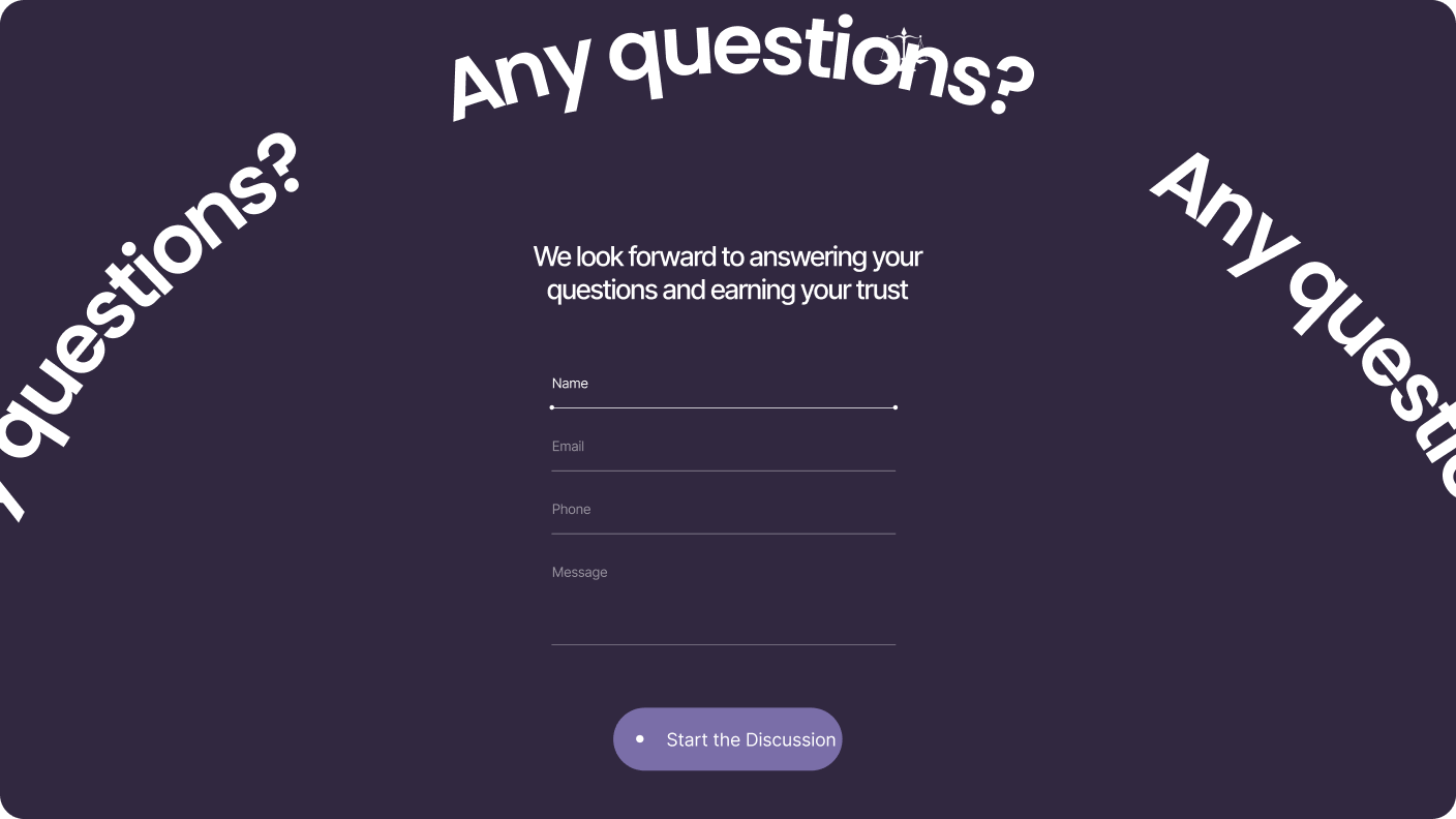
Let's discuss your project
We can improve your website so it becomes more attractive, easier to use, and more effective for business. Leave your details and let's build something strong together.