portfolio
Full-cycle
platform website for
medical therapy
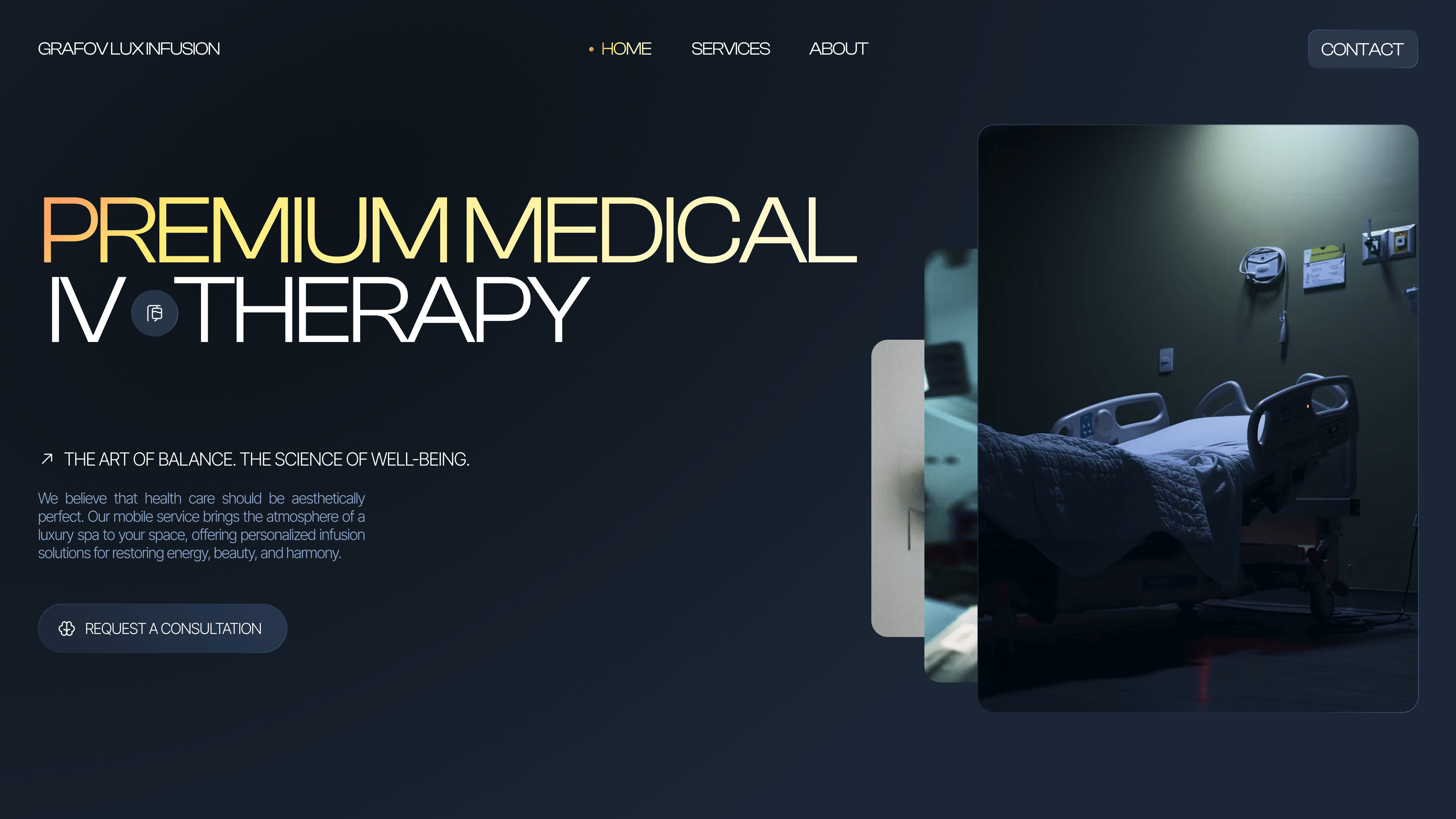
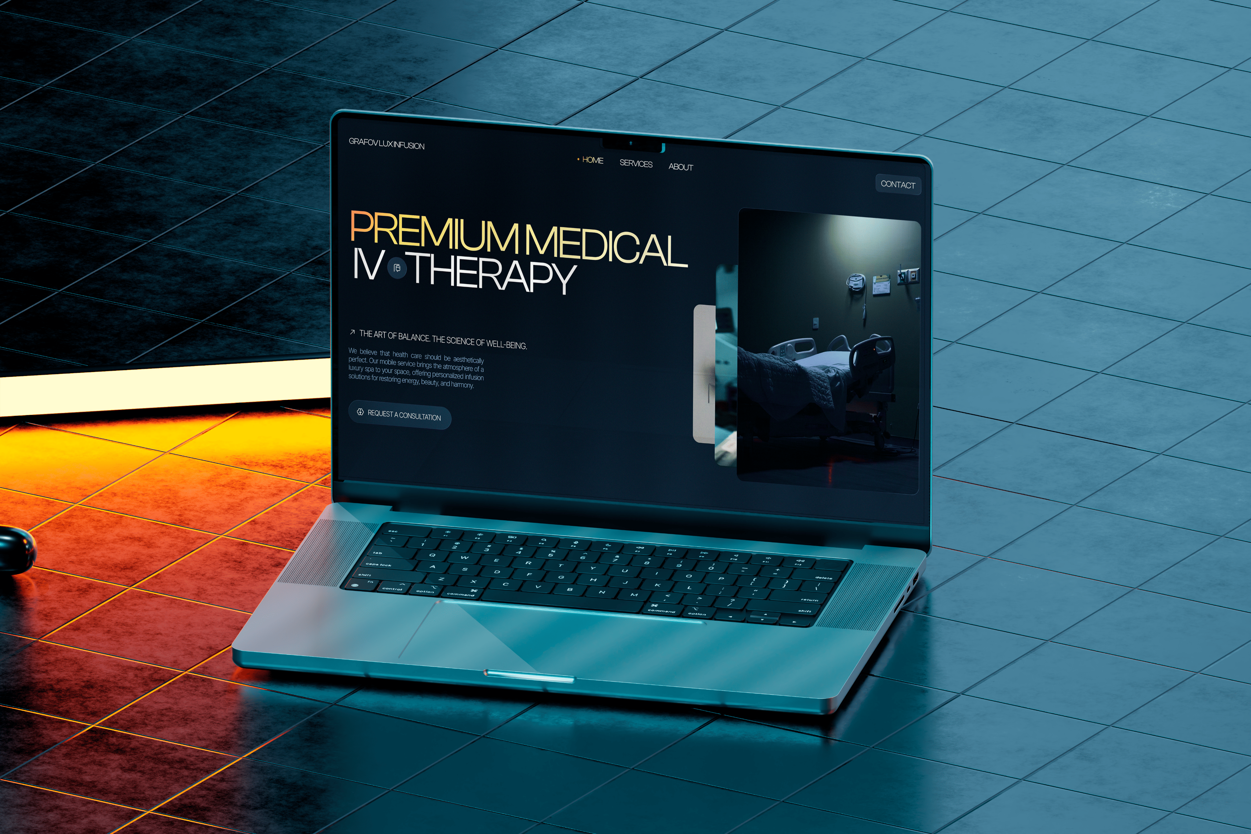
/ The project needed a digital presence that would build trust immediately and avoid looking outdated. For Medical Therapy, we created a calm, disciplined system focused on expertise, readable service hierarchy, and a clear route from the first screen to action.
problems
Challenges We
Faced

Trust before action
/ In a medical service, the user checks competence first and only then thinks about booking. The interface therefore had to persuade from the first second rather than create noise.
Dense service map
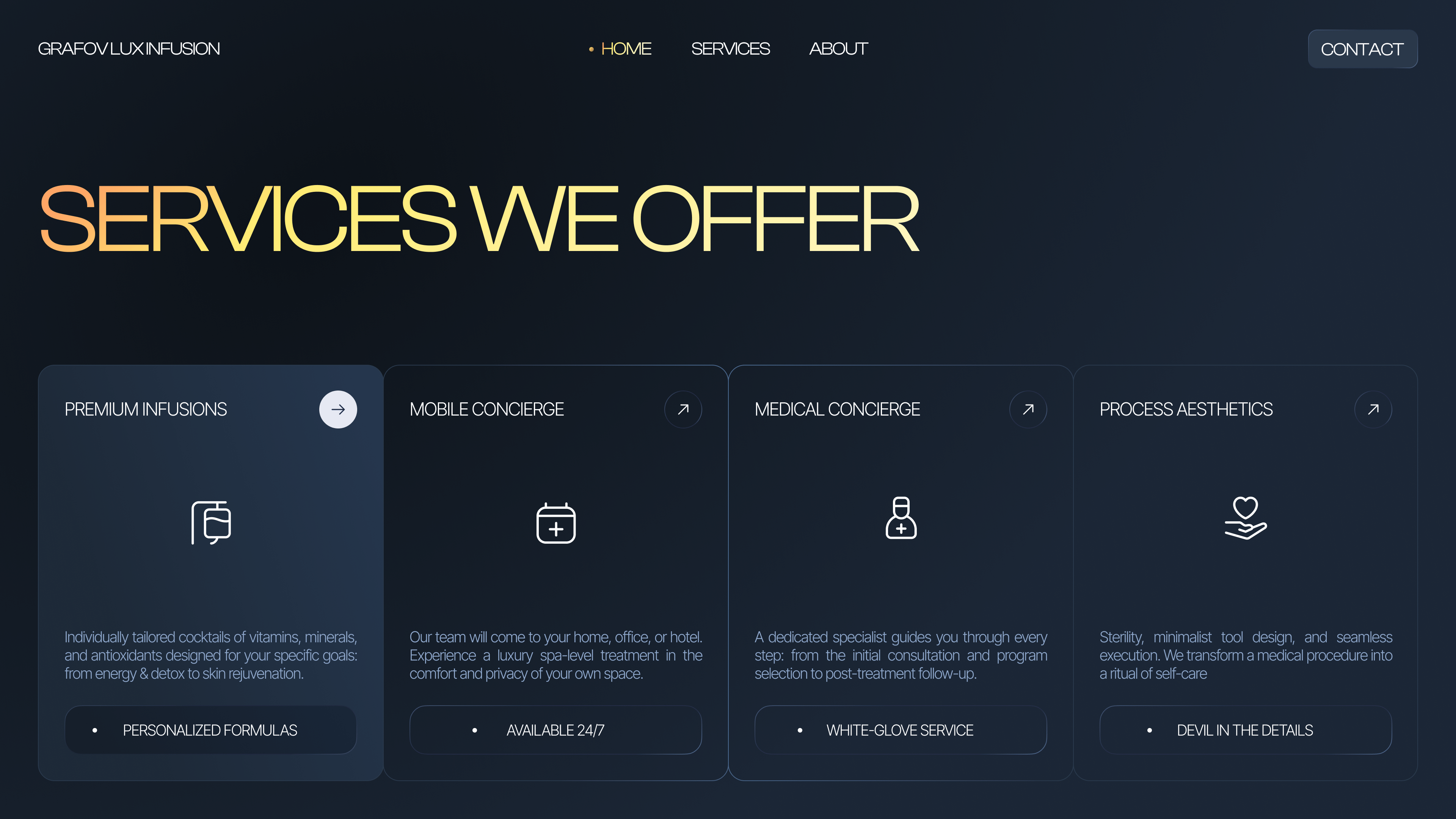
/ Service directions, advantages, and therapy formats could not compete with one another. We organized the content into a clear hierarchy so the offer would be understood quickly.
Calm conversion
/ Healthcare does not tolerate aggressive selling. We shaped the CTAs and key blocks in a soft but confident way, so the route to the next step would feel natural.
Design
/ concept
Expertise without sterility
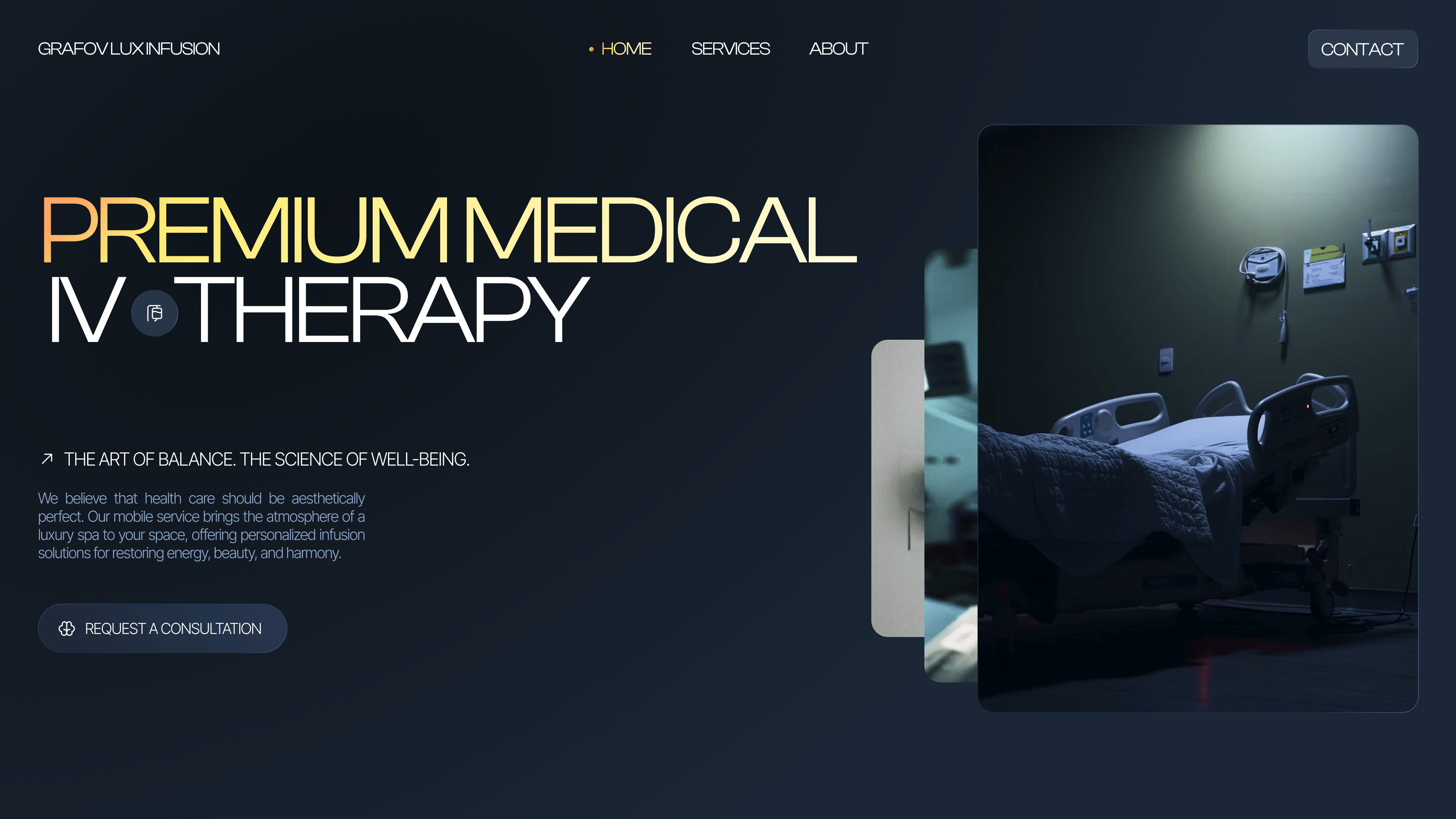
> It was important to preserve a sense of professionalism without slipping into a lifeless corporate tone. That is why we built a dark scene with cool blue accents and crisp modular blocks.
/ ui logic
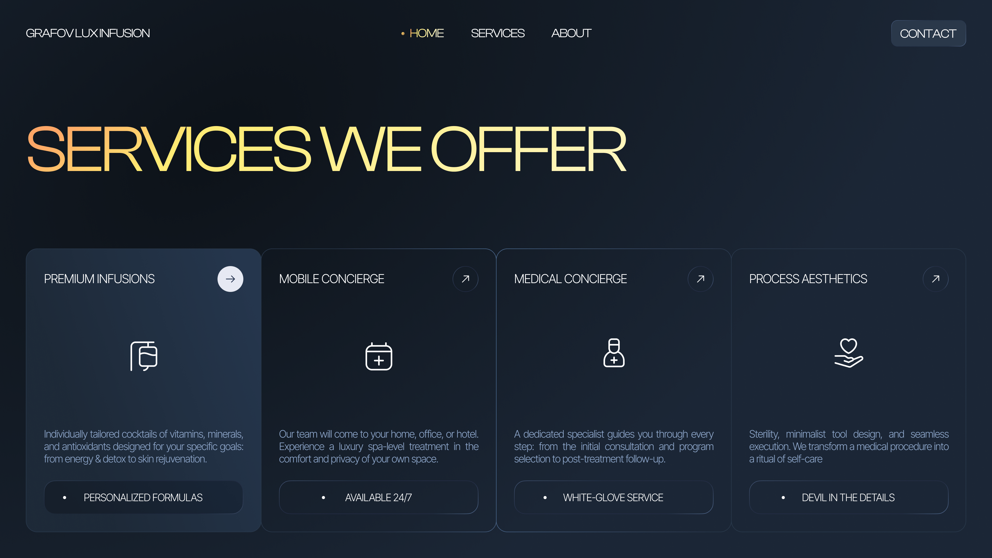
A restrained service presentation
> The screen could not overwhelm a person who had already arrived with a need and some anxiety. We built the rhythm on space, clear sections, and calm typography without decorative pressure.
/ result
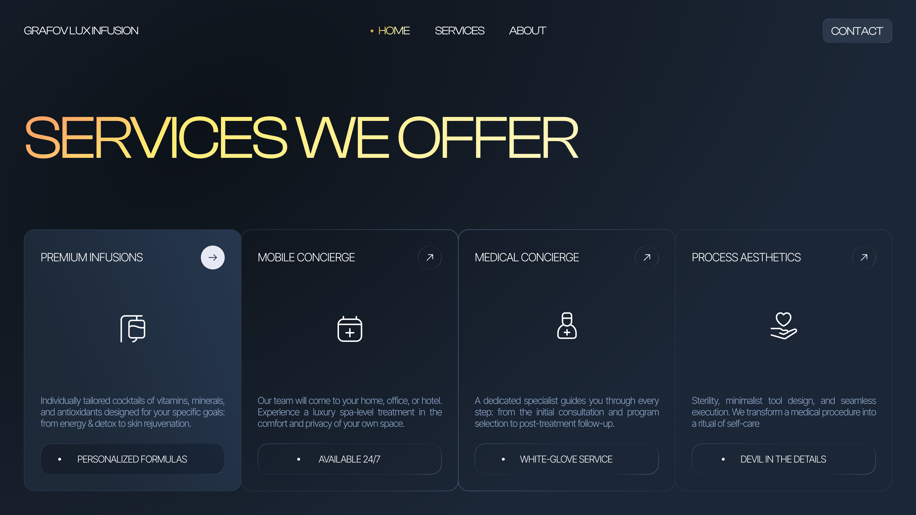
A cohesive digital tool
> The same visual code continues from the hero through the forms and service cards. That is why the site works not as a set of disconnected screens, but as one confident system of trust.
palette
Color palette
/ The palette works in favor of trust: the dark base concentrates attention and makes the brand feel more convincing, while cool steel-blue tones preserve a sense of precision and control.
/ A warm light accent adds contrast in key areas and prevents the interface from becoming clinically cold. That keeps the presentation strict without making it feel distant.
01 / Clinical night
02 / Steel slate
03 / Calm teal
04 / Soft light
typography
Fonts
Poppins

Headlines
Meet Poppins - a clean, geometric sans-serif
Body text
It combines simplicity with a touch of warmth. Readable on screens, elegant in print.
Every letter feels balanced, modern, and friendly.
Poppins
Headlines
Meet Poppins - a calm, confident type system
Body text
It supports dense information without becoming heavy. That is why it works for legal content and long-form case pages.
Every letter feels balanced, modern, and friendly.
Poppins
Headlines
Meet Poppins - a clean, geometric sans-serif
Body text
Readable on screens, restrained in tone and stable in long sections. It helps the layout feel consistent from hero to footer.
Every letter feels balanced, modern, and friendly.
Let's discuss your project
We can improve your website so it becomes more attractive, easier to use, and more effective for business. Leave your details and let's build something strong together.