portfolio
Full-cycle
website for
AI video ads
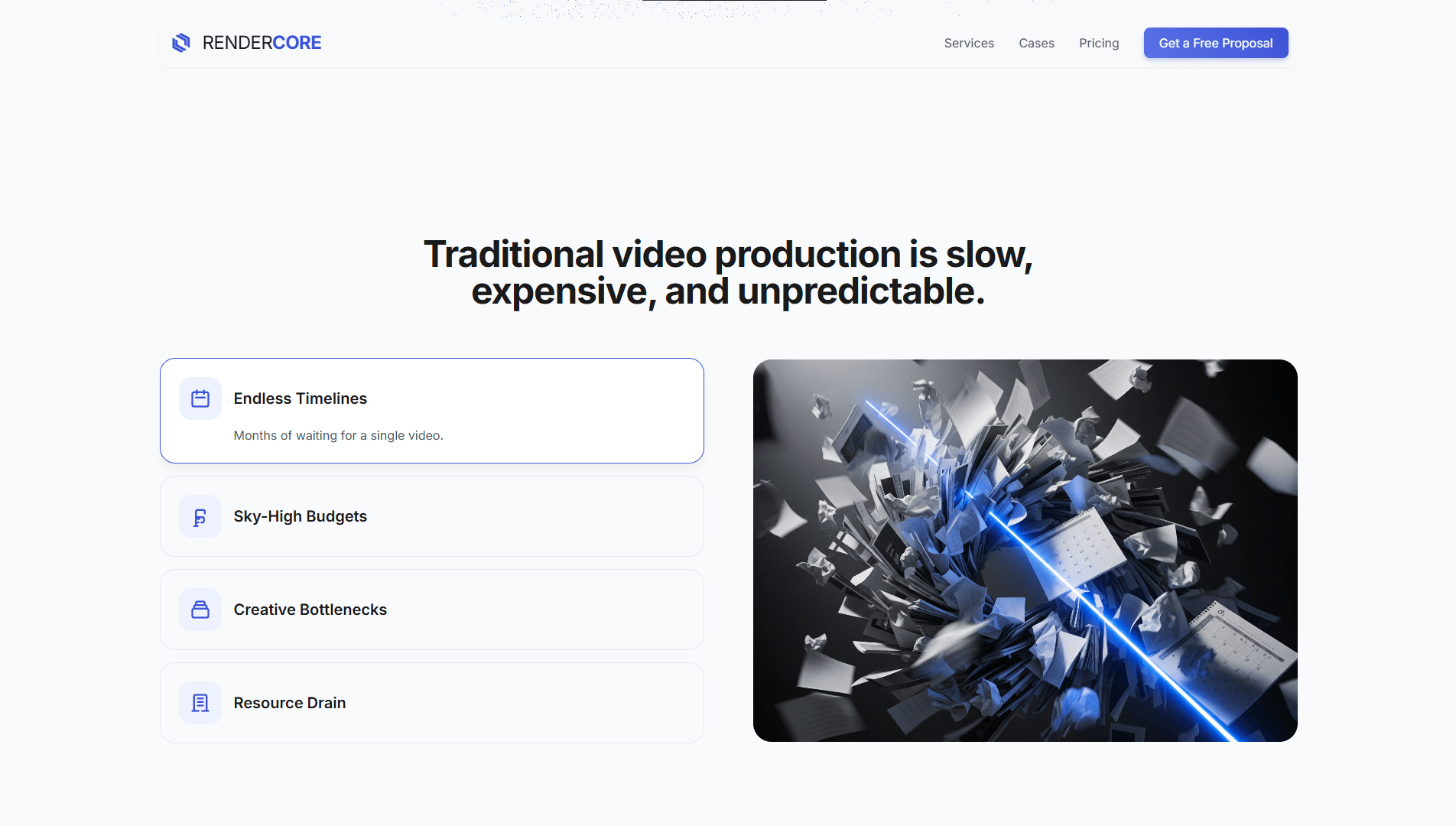
/ The company learned how to produce advertising videos through AI technologies quickly, affordably, and still at a strong quality level. They came to us to build a modern website on a tight schedule, one that would be clear to an IT audience and explain the product without unnecessary decoding.

problems
Challenges We
Faced

Limited source materials
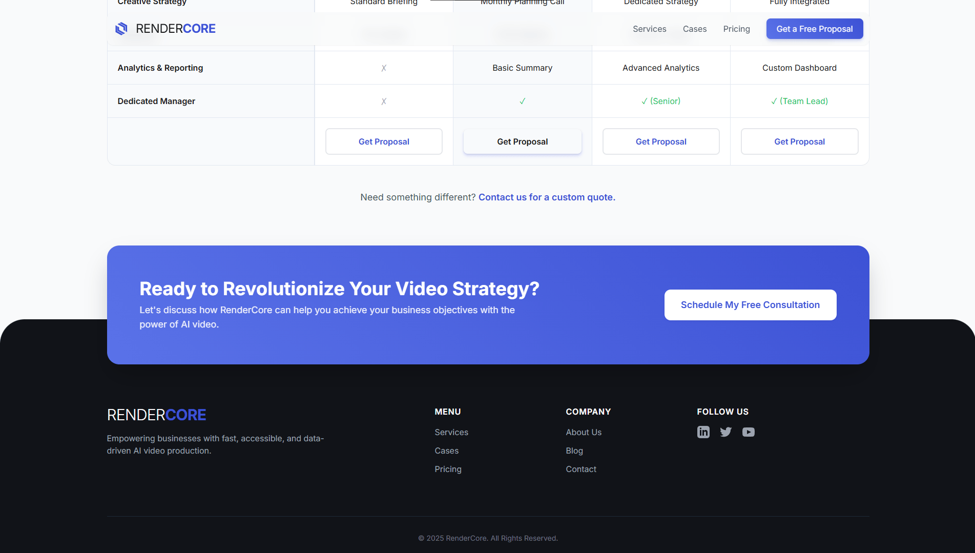
/ There were very few source materials for the design, so we had to assemble part of the visual context ourselves: searching for imagery, shaping the right mood, and building the product image almost from zero.
Credibility without noise
/ A light interface can easily feel empty and anonymous. We reinforced trust through clean typography, breathing room, and product shots without falling into sterile cliché.
Compressed launch window
/ The work had to move on a compressed timeline because the team already had advertising plans in motion. Every decision was made so the site could go live quickly and not slow down marketing.
Design
/ concept
A light product presentation
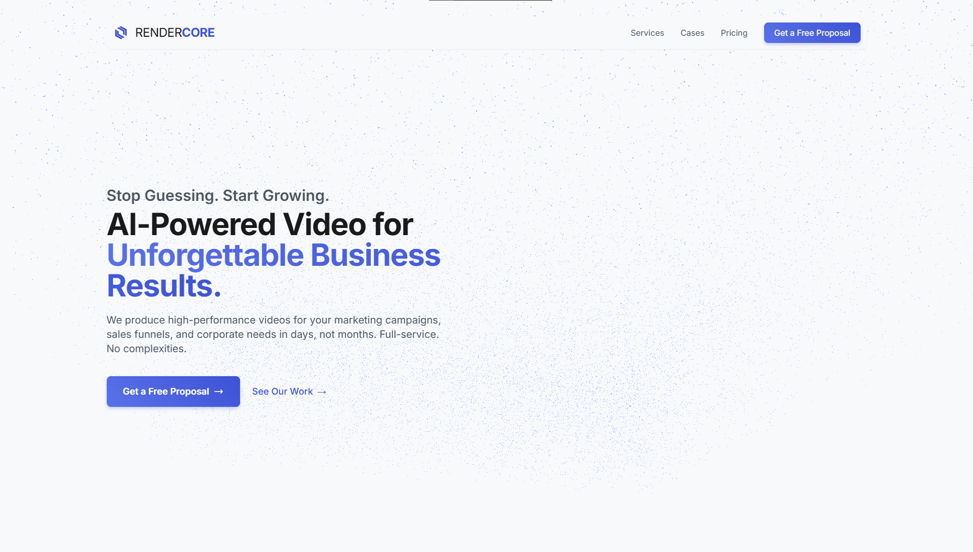
> The concept was built around a clean interface that feels light but not empty. On the first screen, we added an animation where many elements move like a digital universe, creating an immediate association with an AI process without literal metaphors.
/ ui logic
Control over data density
> We deliberately kept the interface from becoming too dense: one module, one idea; one color accent, one focus point. That is what makes the platform feel lighter and cleaner.
/ result
The product is clear without extra words
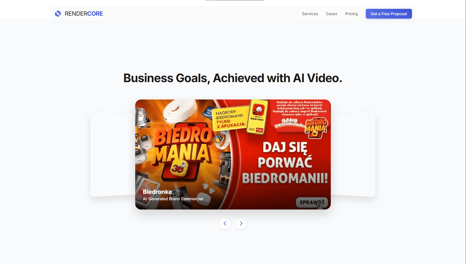
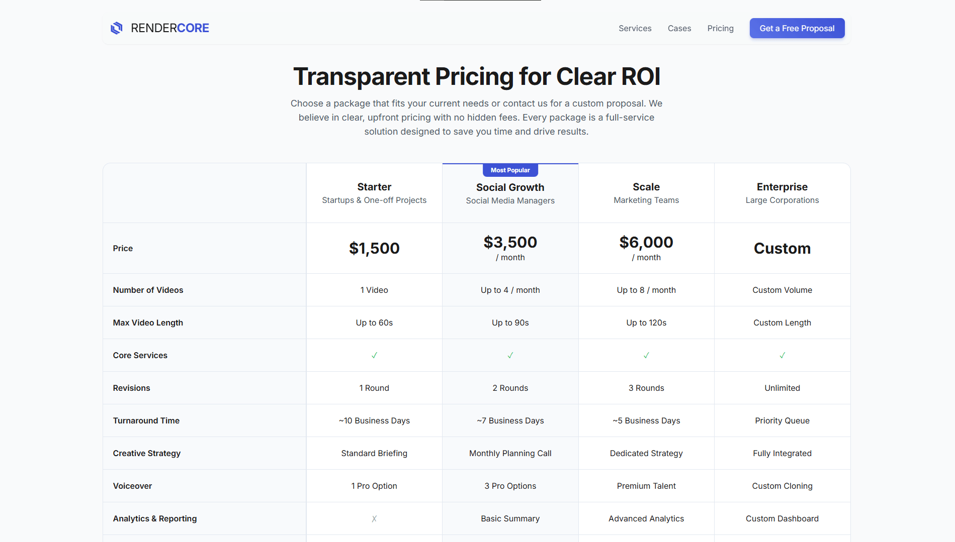
> We built the design so the site explains the product, the service cost, and the next steps on its own. That way the user gets answers quickly and does not leave looking for extra clarification.
palette
Color palette
/ The light base makes the interface feel lighter and increases the sense of product transparency. At the same time, blue accents give the system the right technical tone and help highlight key actions.
/ Neutral shades work like air between data blocks and cards. Because of them, the interface does not become tiring in long flows and stays comfortable across different screens.
01 / Soft white
02 / Sky mist
03 / Product blue
04 / Soft violet
typography
Fonts
Inter

Headlines
Inter keeps the interface modern, neutral and clear.
Usage
We used it as the core typeface so the site could explain a technical product without looking heavy or corporate.
It supports the light product tone the project needed.
Inter
Headlines
At small sizes, Inter stays stable in dense content blocks.
Usage
That matters when the site needs to explain technology, pricing and user steps quickly inside a light layout.
It keeps the product readable without adding visual pressure.
Inter
Headlines
One typeface makes the whole site feel consistent.
Result
From hero statements to explanatory sections, the interface stays clean and understandable for an IT-oriented audience.
That is why Inter became the only typographic base here.
Let's discuss your project
We can improve your website so it becomes more attractive, easier to use, and more effective for business. Leave your details and let's build something strong together.