
portfolio
Full-cycle
portal for
ikonopisec.com
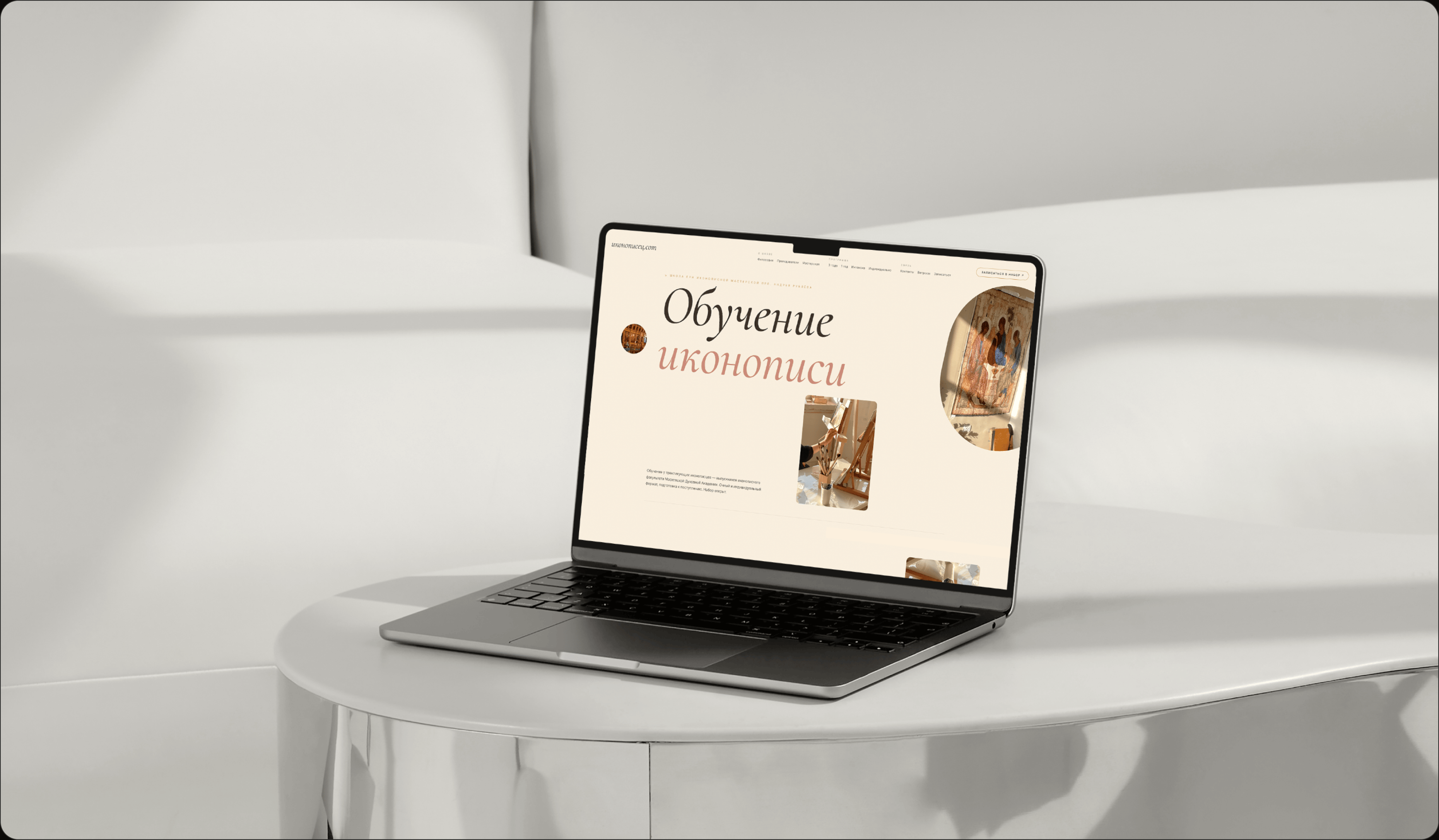
/ ikonopisec.com is an icon painting workshop in Sergiev Posad, opened in honor of Saint Andrei Rublev. From the beginning, the project was conceived as a full portal for different audiences connected to faith and icon painting: students, clients, the workshop itself, the church environment, and people just looking for an entry point into the subject.

problems
Challenges We
Faced

Creative canon tension
/ The client was a highly creative person who wanted an unusual, living design, while competitors mostly had old and visually weak websites. Given the specifics of the niche, finding a language that felt fresh without breaking trust was genuinely difficult.
Sacred tone vs commerce
/ In places where commercialization appears, it could not be pushed too hard. We had to preserve a respectful and quiet tone because the project is tied not just to a service, but to a sacred context.
Multi-audience structure
/ The architecture had to support different flows and target audiences at once. Making sure all those branches stayed inside one overall context and did not fight each other was one of the hardest tasks in the project.
Design
/ concept
Light as the primary material
> The design was based on a warm, ascetic materiality where everything is built around light and brightness. The palette takes its cues from levkas, ochre, cinnabar, and soft gold, while its mood leans on the color language of Rublev's Holy Trinity.

/ ui logic
Asymmetry and living rhythm
> We stepped away from aligned grids and sterile card rows: blocks shift, headlines slide, and round shapes overlap rectangular ones. That gives the page the breath of a handwritten sheet and the kind of living asymmetry held together not by chaos, but by small precise offsets.

/ result
A portal without aggressive selling
> The result is a design that gently guides different audiences through their routes without turning the project into an ordinary commercial landing page. It explains the workshop, the learning path, the mission, and the entry points calmly, respectfully, and without losing modernity.

palette
Color palette
/ The palette starts with the levkas tone taken from ikonopisec.com: soft, light, and carrying the feeling of a prepared board and silence. We added ochre and sacred gold as warm supports so the visual language would not feel flat while still preserving the materiality of the craft.
/ Dark umber holds the text and contour, while icon gold works as a calm warm accent. Together they support the feeling of craft, light, and church materiality without adding unnecessary decoration.
01 / Warm white
02 / Levkas
03 / Dark umber
04 / Icon gold
typography
Fonts
Cormorant Garamond

Headlines
Cormorant Garamond brings a printed, liturgical gravity.
Usage
Its antique structure and thin italic movement reference church printing without turning the page into costume drama.
It gives the portal dignity before the user reads a single paragraph.
Caveat
Accent
A handwritten aside, like the master’s note in the margin.
Usage
We use it sparingly, only where the interface needs a human trace rather than another formal heading.
This is the warm voice that prevents the system from becoming too rigid.
Inter
UI / metadata
Inter keeps signatures, labels and interface text calm.
Result
Together, the three voices do not compete: one gives liturgical depth, one gives a human note, and one keeps the portal usable.
Inter is the quiet register that allows the rest to breathe.
Let's discuss your project
We can improve your website so it becomes more attractive, easier to use, and more effective for business. Leave your details and let's build something strong together.