portfolio
Full-cycle
mobile app for
food delivery
/ The client was an entrepreneur from Georgia and the owner of a restaurant chain across the country. He knew the weak points of existing market solutions and came to us to build a turnkey product: faster, easier, and stronger in user flow than what people were already used to.
problems
Challenges We
Faced

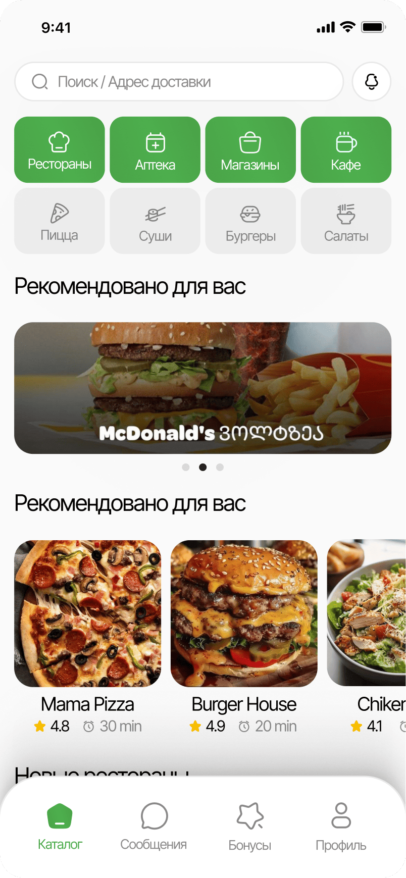
Overloaded choice
/ Delivery products show the user many entities at once: restaurants, categories, prices, offers, and bonus systems. We shaped the structure so the choice felt fast rather than exhausting.
Appetite without chaos
/ The food has to look appetizing, but the interface cannot dissolve into visual noise. We kept the balance between emotion, bright accents, and a clean grid.
Return-friendly flow
/ The ordering flow had to do more than reach checkout. It also had to make people want to come back. That is why we kept the route short, clear, and convenient for repeat actions.
Design
/ concept
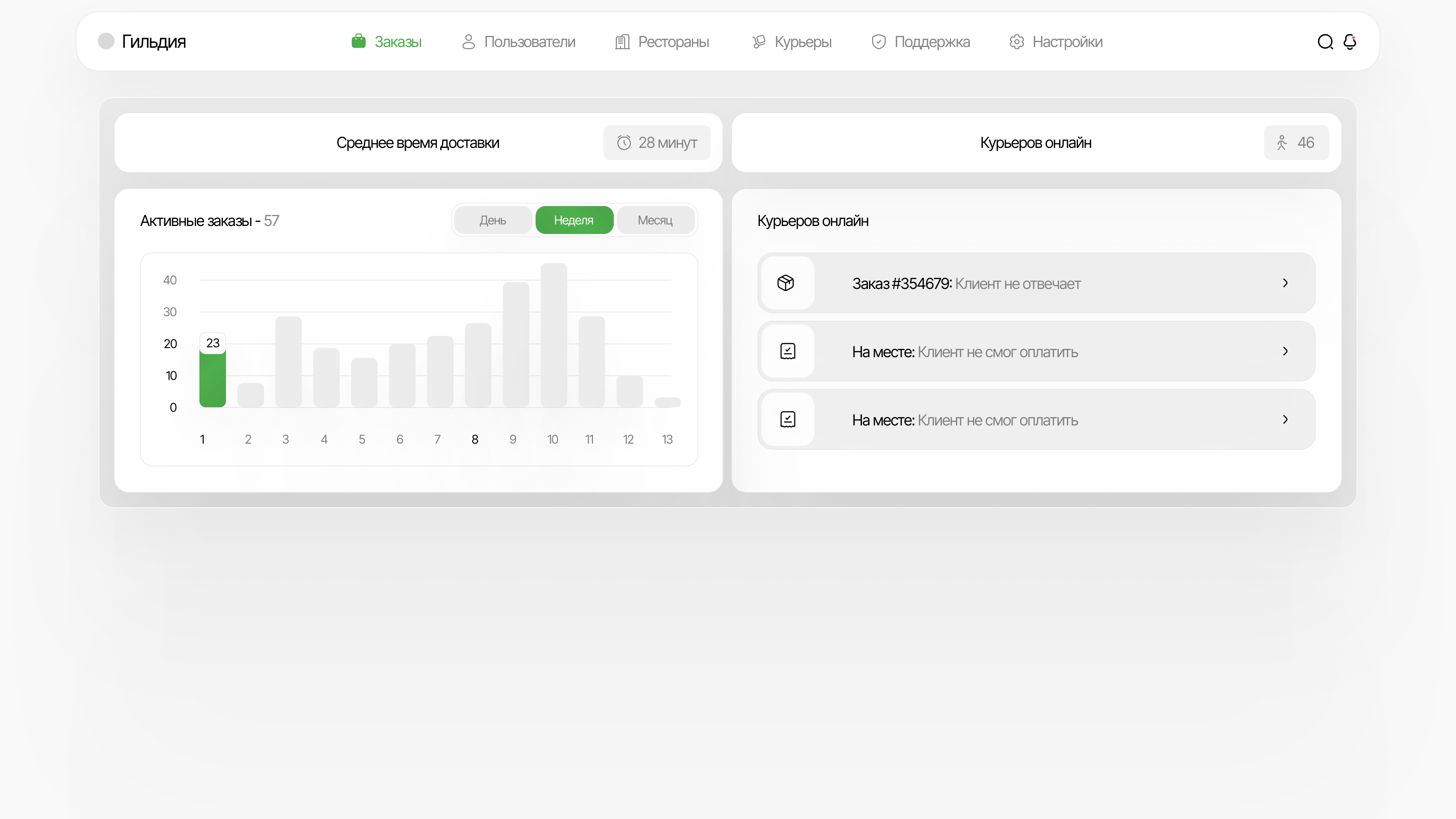
An ecosystem without extra complexity
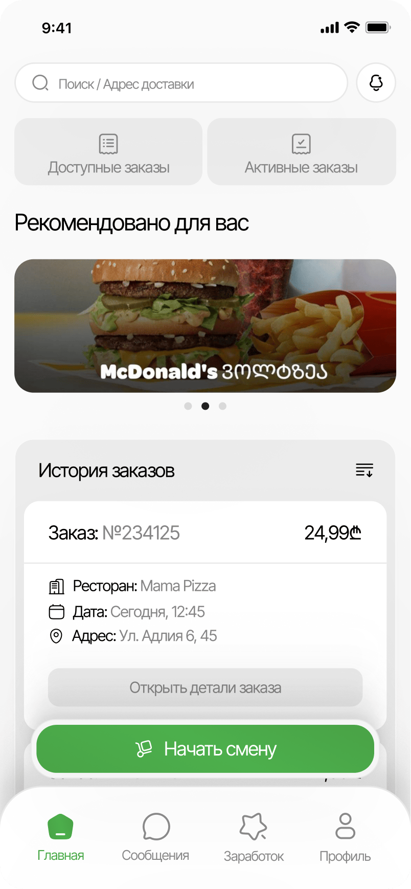
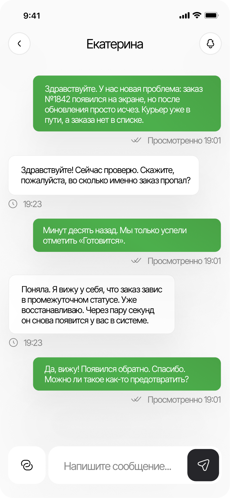
> We designed not only the client app, but also the courier side, the restaurant side, and the admin layer. With that level of structural complexity, it was critical to keep the design simple and light so development would not drag on for years.
/ ui logic
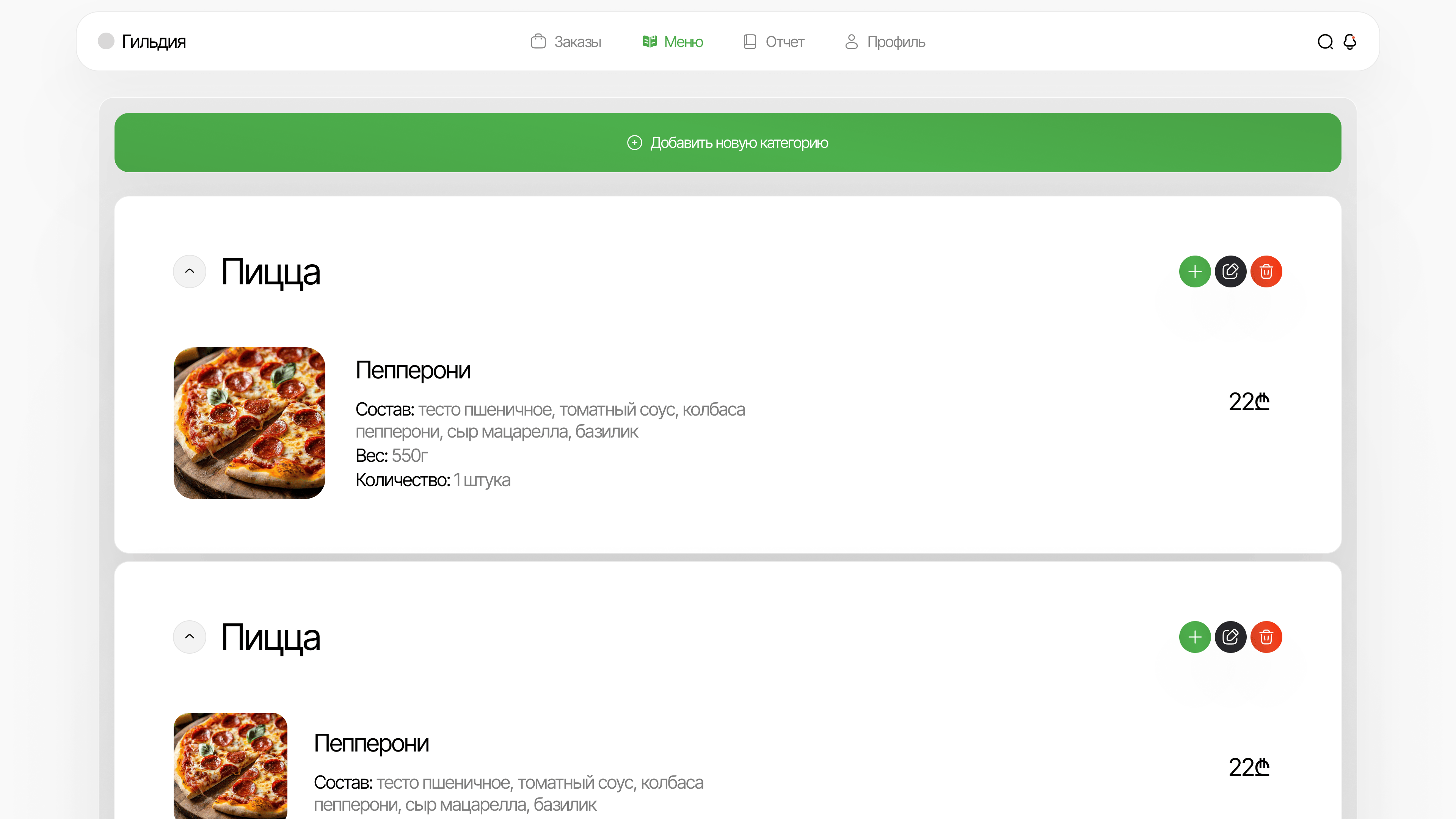
A fast user rhythm
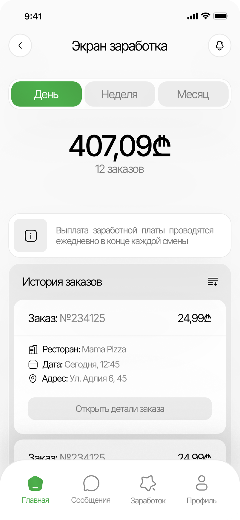
> The screen reads from top to bottom without unnecessary detours: categories, cards, CTAs, and order assembly sit exactly where the user expects them. That is what makes the interface feel light and fast.
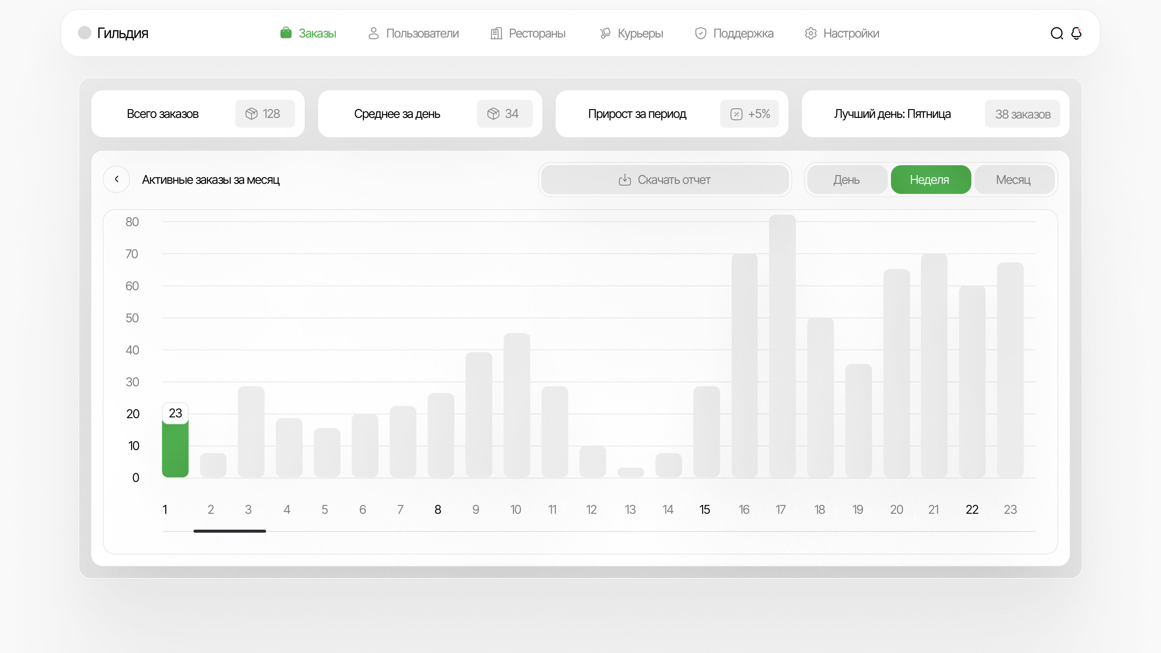
/ result
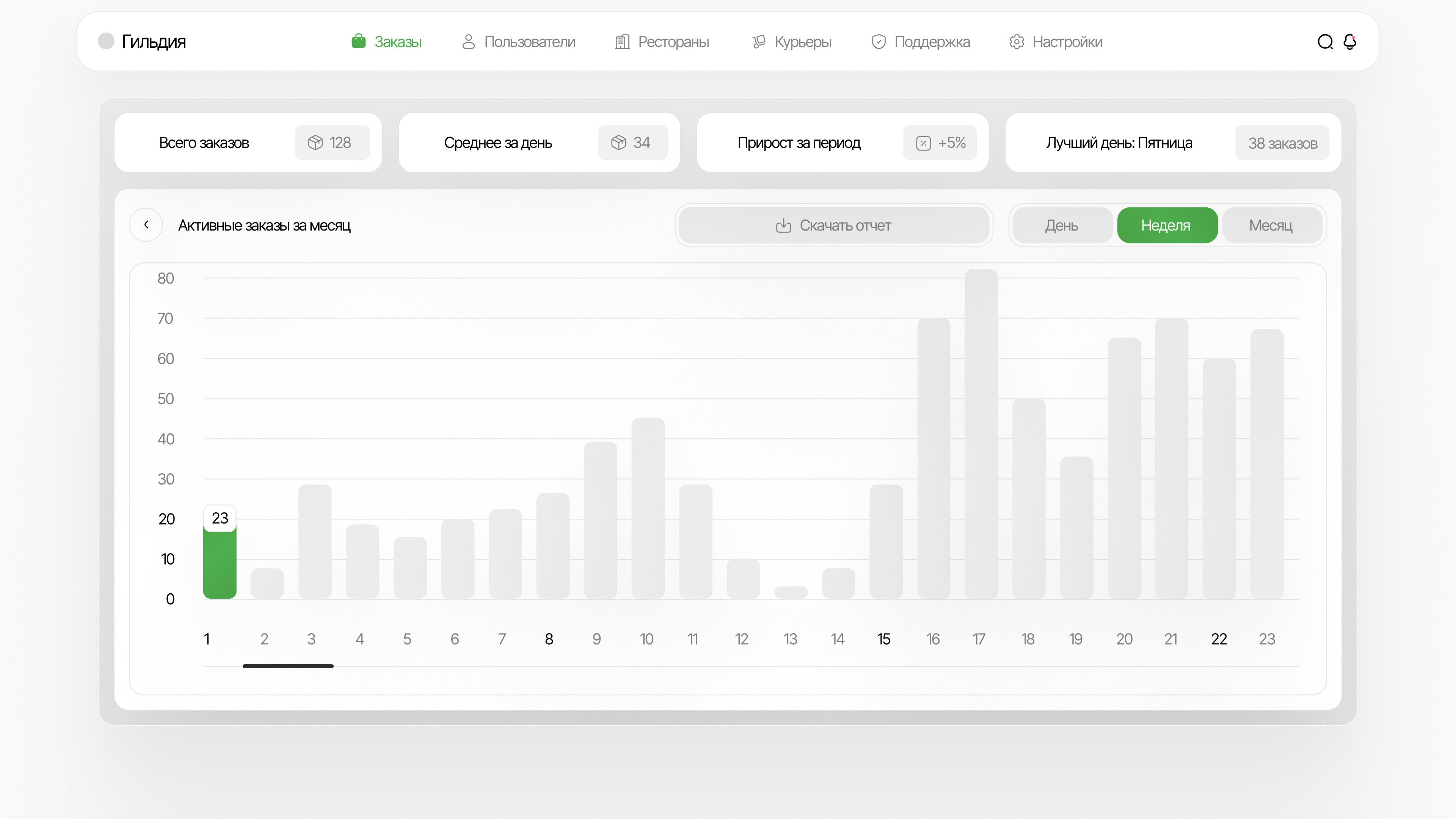
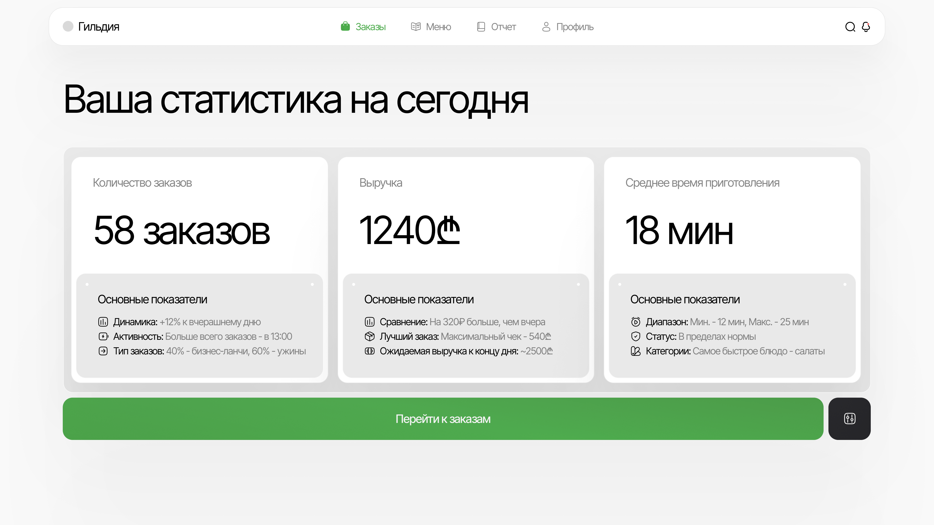
A new restaurant management system
> We designed a new restaurant management system so it would be convenient, visually strong, and informative from day one, while still leaving room to expand the product calmly in the future.
any device
[ mobile first ]
Mobile version
palette
Color palette
/ The key in this palette is the contrast between a calm neutral base and quick action accents. Green carries freshness and trust, while orange-red pulls focus toward CTAs and pricing.
/ Light surfaces leave enough air in the interface and let the food photography speak more vividly. That keeps the app from feeling overloaded even with dense content.
01 / Milk base
02 / Graphite
03 / Fresh green
04 / Hot orange
typography
Fonts
Inter Tight

Headlines
Inter Tight keeps mobile UI direct, clean and fast.
Usage
We used it as the main typeface so menus, cards, prices and CTA blocks stay readable at speed.
It supports the quick rhythm that food delivery needs.
Inter Tight
Headlines
The typeface stays stable across dense product screens.
Usage
That matters when one product includes the client app, courier flows, restaurant tools and admin interfaces.
It helps the whole system feel unified instead of fragmented.
Inter Tight
Headlines
One typeface keeps hierarchy predictable across all roles.
Result
From catalog screens to restaurant management, the product stays consistent and does not overload development with extra visual layers.
That is why Inter Tight became the entire typographic base.
Let's discuss your project
We can improve your website so it becomes more attractive, easier to use, and more effective for business. Leave your details and let's build something strong together.