
portfolio
A new website for
an industrial
electrical contractor
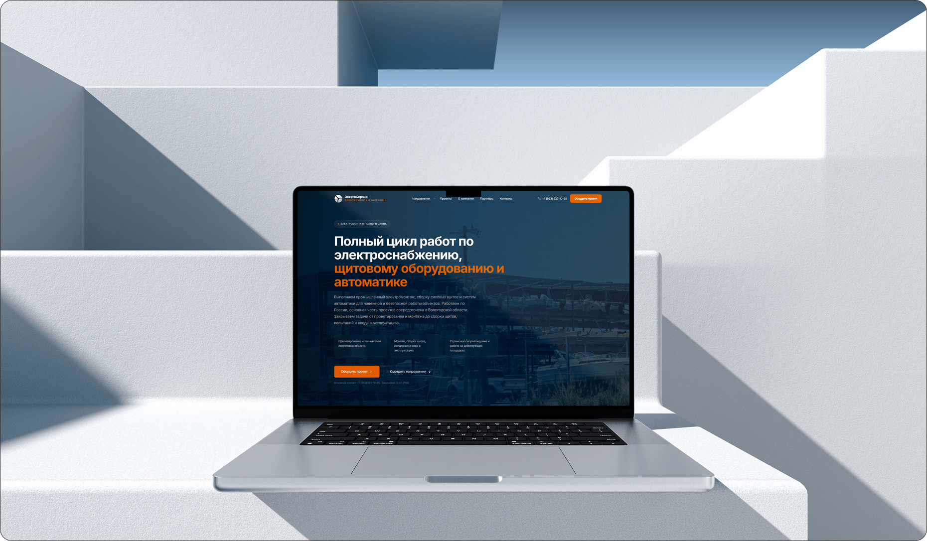
/ The company had a very old website that had not been touched for a long time, and the director decided to seriously start moving in the digital space. He came to us for the design and development of a new website that would do more than refresh the look. It had to become a clear entry point into the company's modern commercial layer.

problems
Challenges We
Faced

Industrial vs commercial split
/ The website had to support both the industrial and commercial layers from the start, while still separating users into different flows so they would not get lost or overwhelmed. That required very precise routing from the first screens.
No source materials
/ We had no ready-made materials for a full visual presentation. All the photos, content scenes, and supporting imagery had to be sourced and assembled by us while maintaining one level of quality and realism.
Raising the niche standard
/ Competitors were operating at a noticeably lower level in both structure and presentation, so the task was not simply to make a decent website. We had to set a new standard for the niche. That affected the rhythm of the interface, the density of trust-building blocks, and the overall discipline of the design.
Design
/ concept
An engineering language without visual heaviness
> We built a modern visual layer where industrial scale is clearly felt, but the interface does not collapse into heavy technical aesthetics. The dark blue base creates reliability, while orange signal accents help gather attention around the right actions and choice zones.

/ trust system
Industrial flows without friction
> We designed the site so the industrial and commercial layers were separated but did not argue with one another. Distinct entry points, clear direction blocks, and understandable route cards help the user quickly see where their scenario begins and what comes next.

/ result
A new level for the niche
> The result is a website that looks stronger than familiar competitor pages while still working as a practical commercial tool. Through structure, rhythm, and careful alignment with real business tasks, it sets a higher visual and strategic standard for the segment.

palette
Color palette
/ The palette comes from the real EnergoService website: a deep engineering navy, the main corporate blue, an orange action signal, and a light working surface for the interface. Together they create industrial trust without making the page visually heavy.
/ Orange works as the routing and commercial accent color, while the light base keeps enough air around services, completed projects, and technical explanations. The result feels modern, but still practical.
01 / Engineering navy
02 / Corporate blue
03 / Signal orange
04 / Light interface base
typography
Fonts
Inter

Headlines
Inter keeps the industrial tone clean, direct and unsentimental.
Usage
Large headings stay sharp and practical, which is important when the site speaks to both production and commercial decision-makers.
It gives the brand a more current and disciplined voice.
Inter
Body / interface
Dense service and direction pages remain readable.
Result
The same family supports routing, service blocks, forms and technical explanations without forcing the interface into unnecessary stylistic noise.
That makes the site practical, scalable and easy to trust.
Inter
Result
Dense service and direction pages remain readable.
Result
The same family supports routing, service blocks, forms and technical explanations without forcing the interface into unnecessary stylistic noise.
That makes the site practical, scalable and easy to trust.
Let's discuss your project
We can improve your website so it becomes more attractive, easier to use, and more effective for business. Leave your details and let's build something strong together.