portfolio
Full-cycle
platform for
a freight exchange
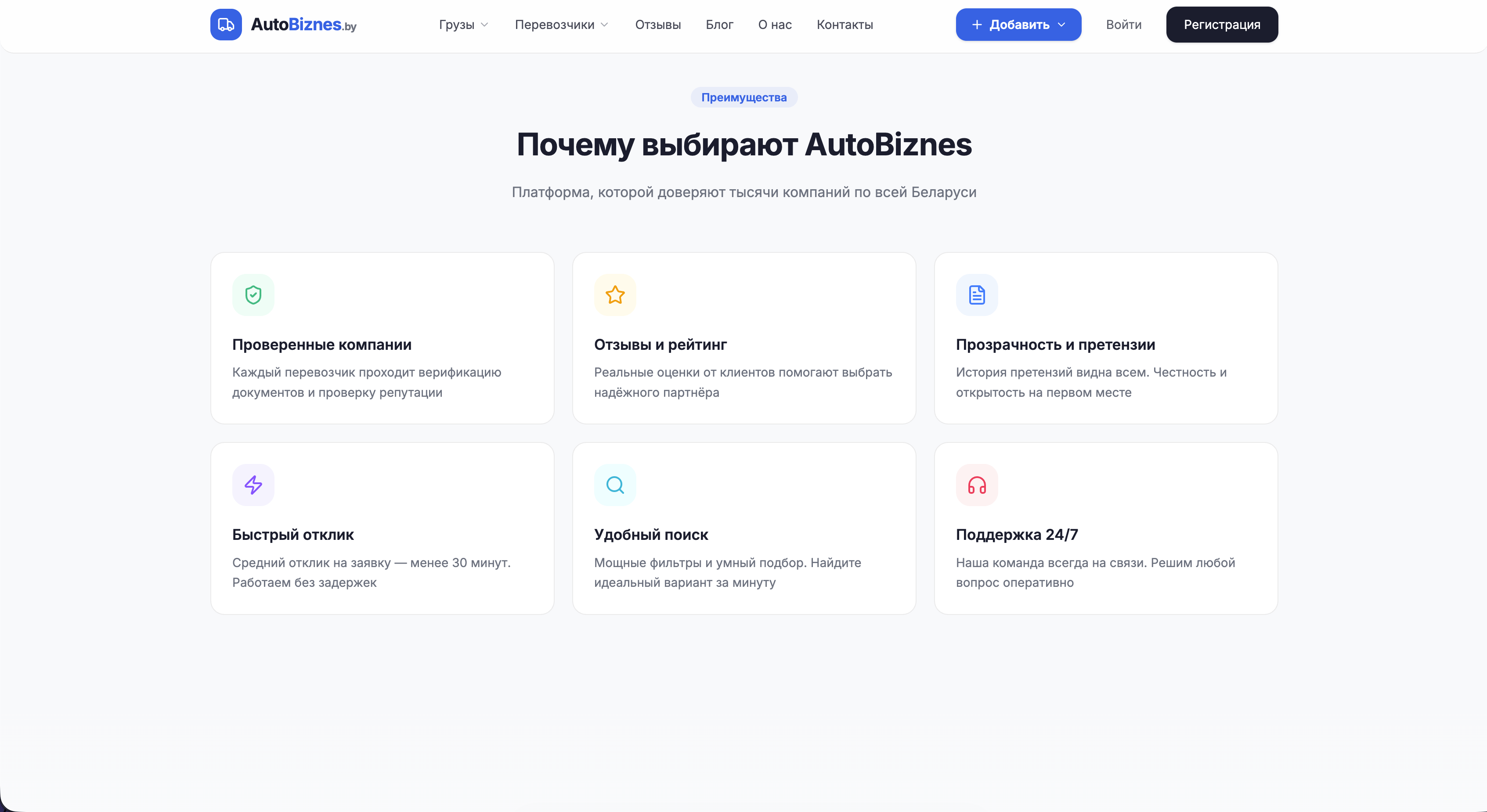
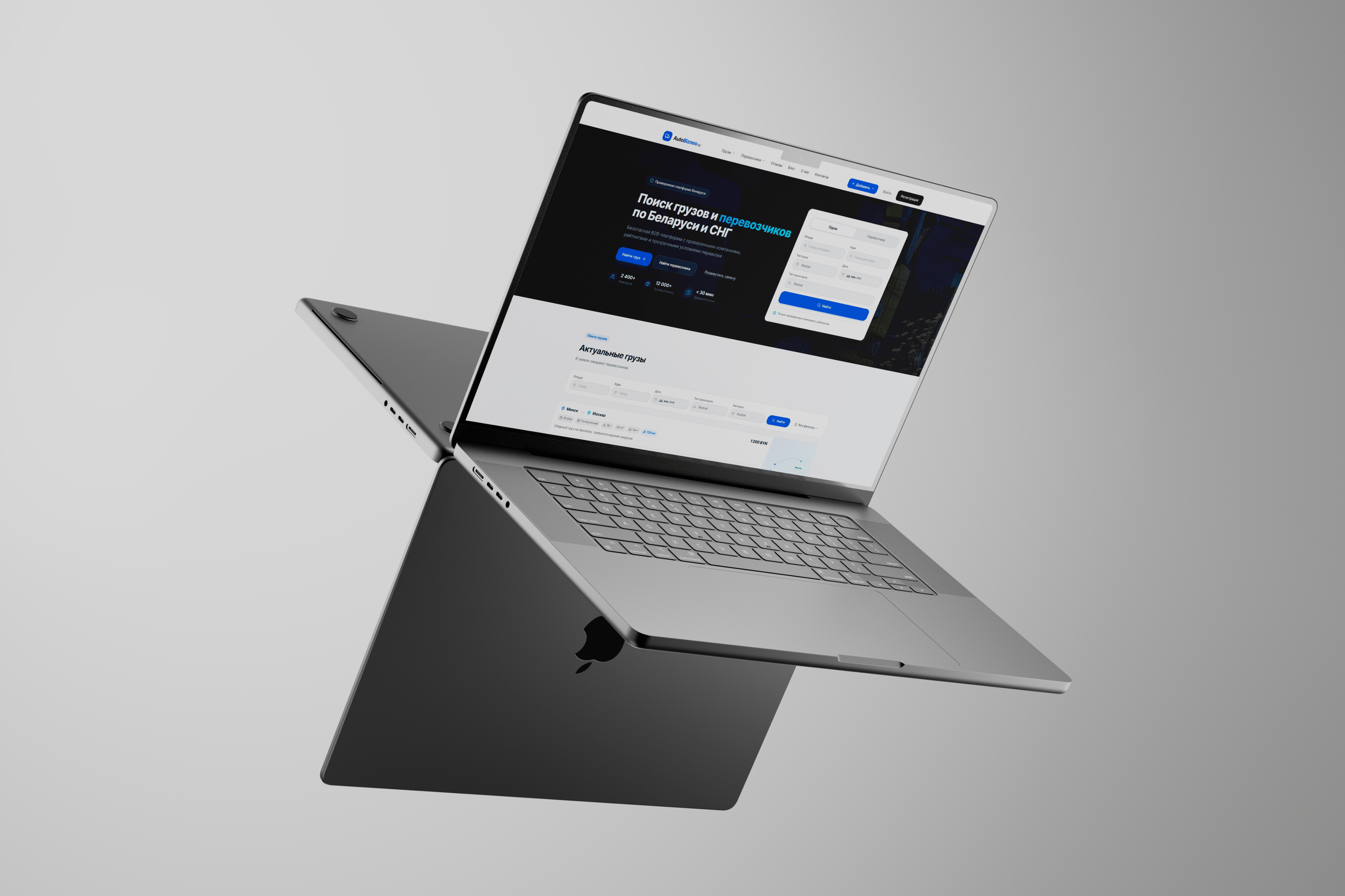
/ This is a freight marketplace in Belarus, founded in 2016 and acquired by a new owner at auction in early 2026. Even though a website already existed, we did not rely on the old system and rebuilt the platform from scratch with new role logic, user flows, and interfaces to turn the service into a strong market product.
problems
Challenges We
Faced

Rebuilding from zero
/ Formally, a website already existed, but in reality we could not build on it. The architecture, logic, and visual language had to be created from zero, almost intuitively, as if for a completely new product.
Massive product scope
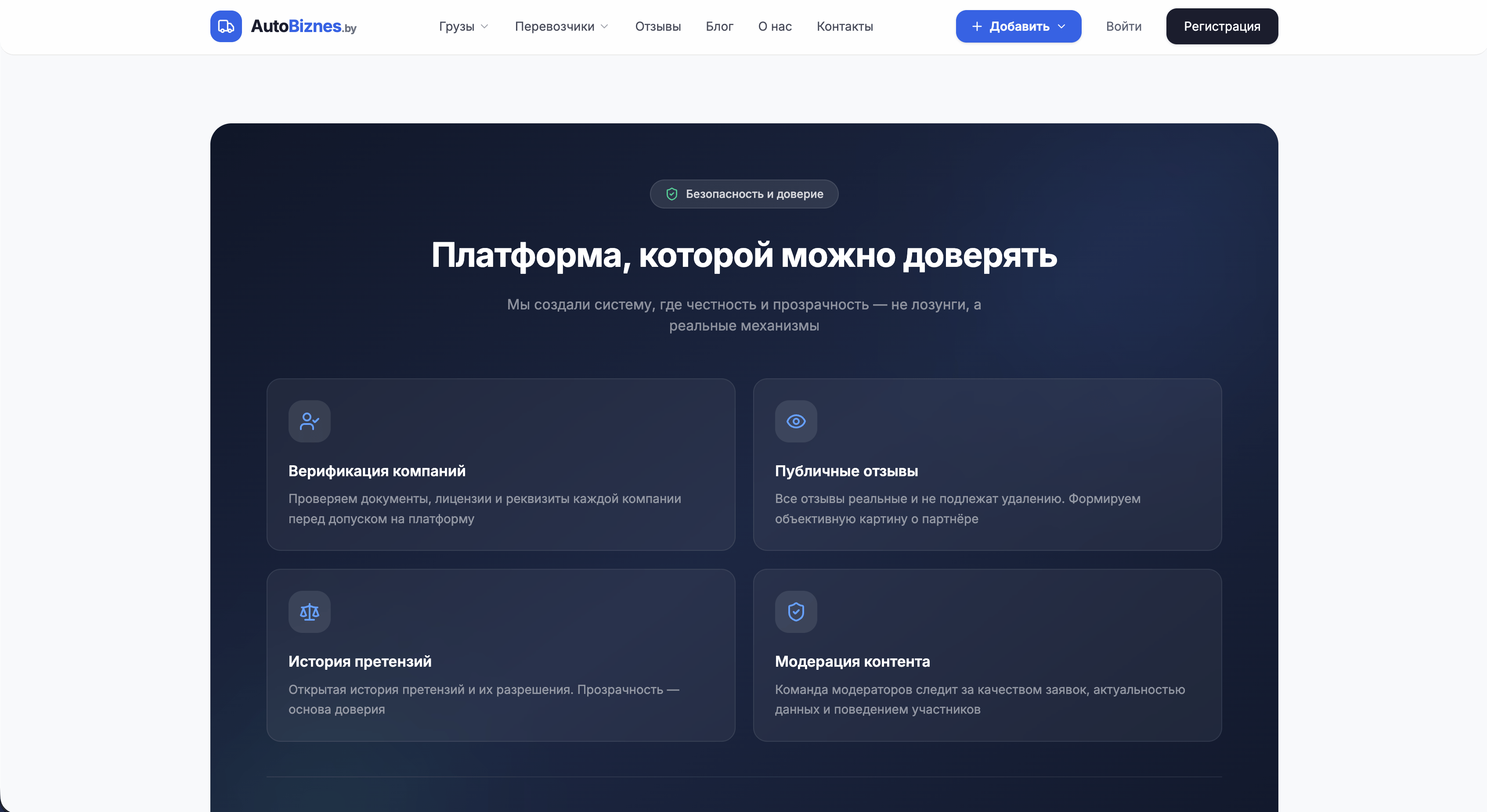
/ The scope was massive: many roles, screens, flows, and internal states. We had to turn all of it into a system that would not fall apart as the product kept growing.
Controlled complexity
/ The user needed to understand how to use the platform quickly. Control mattered more than beauty for its own sake. At the same time, the interface could not scare clients away with complexity compared to simplified competitors.
Design
/ concept
A clear product system
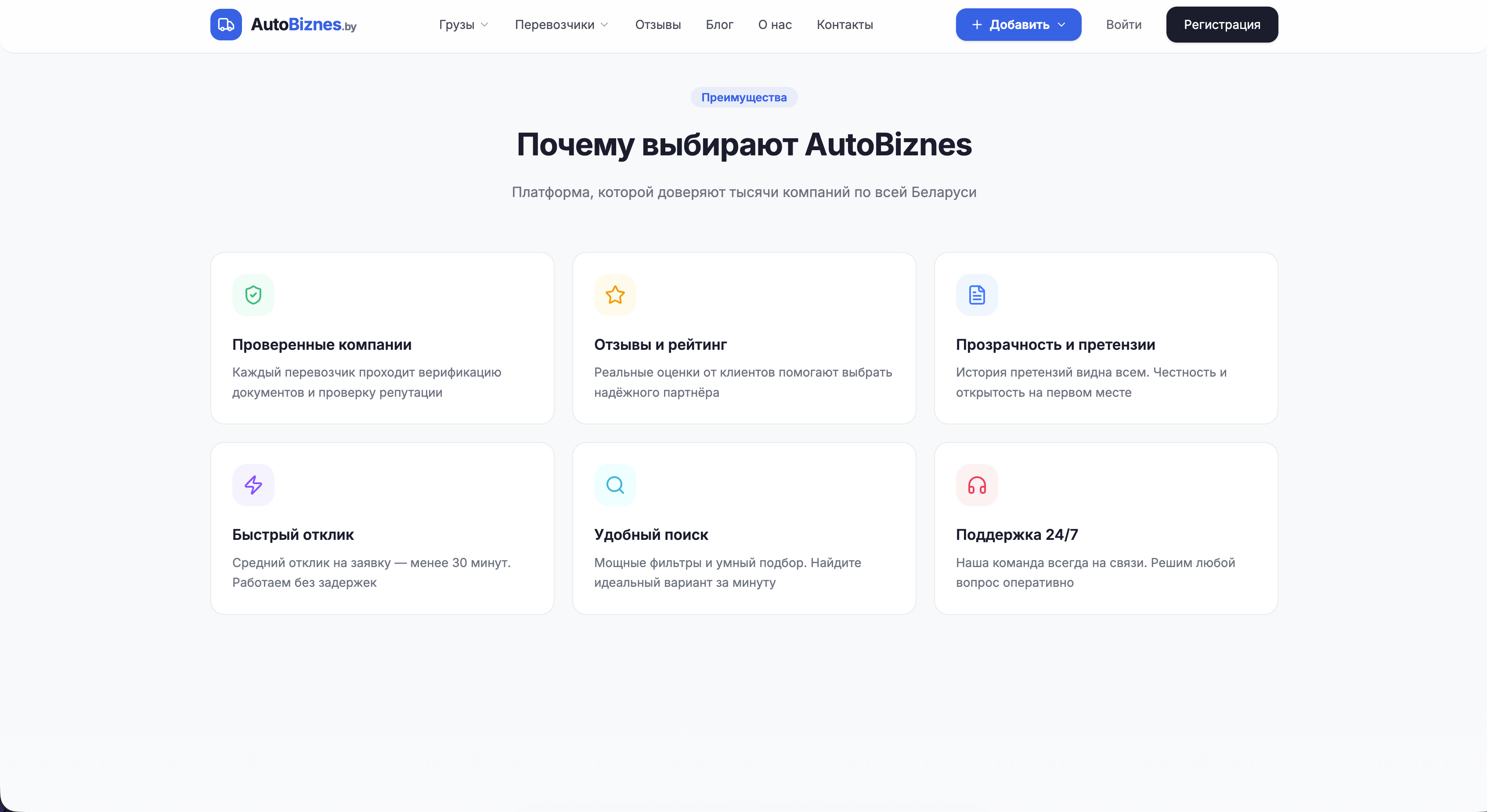
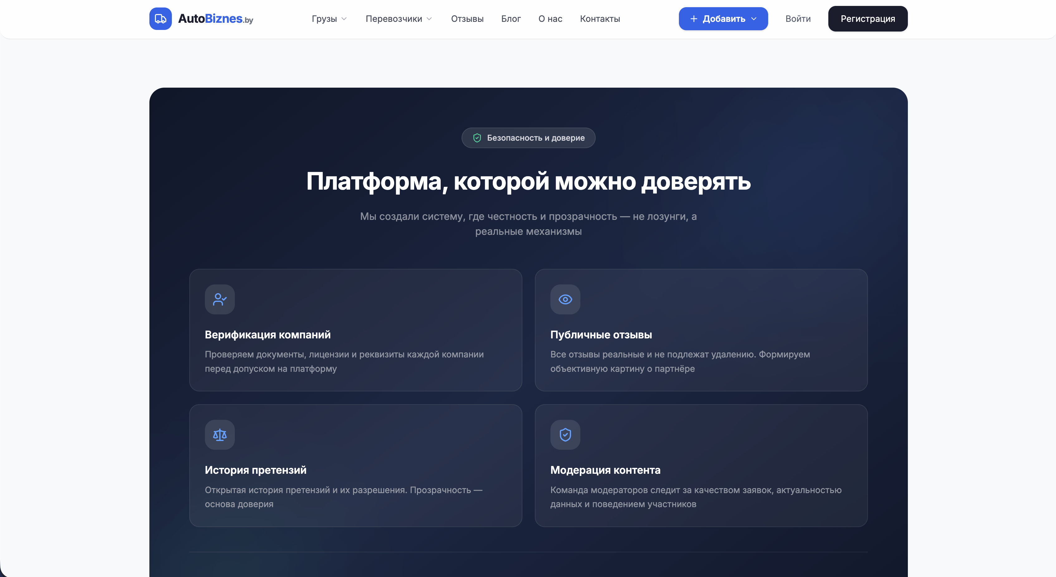
> We focused on an interface where the complexity of the marketplace feels controlled. A light base, neat blue accents, and clear modularity make the platform feel lighter without losing seriousness.
/ ui logic
Flows without visual heaviness
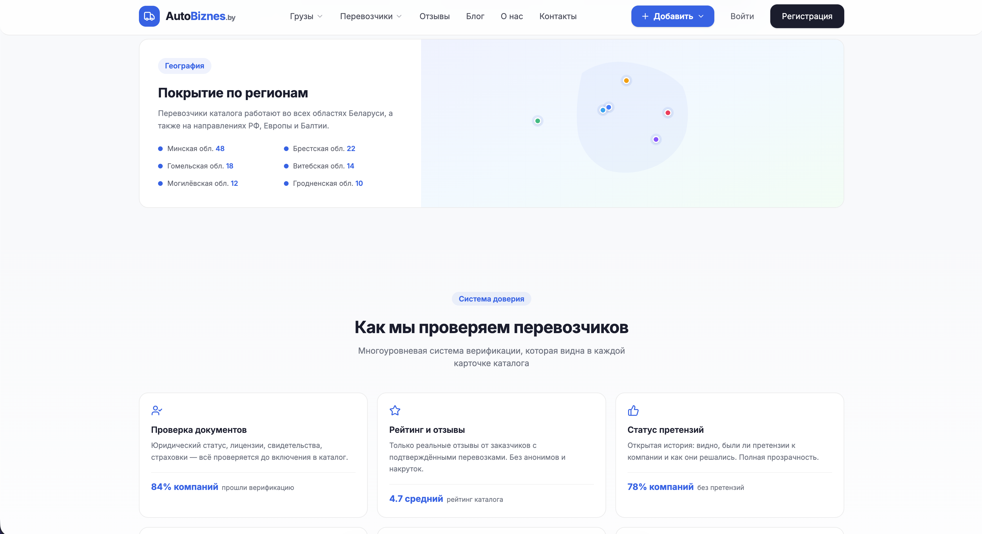
> Inside the product there are many roles, tables, cards, and settings. We organized them so every flow reads clearly and the user never loses the sense of structure, even in long routes.
/ result
A base for a scalable product
> All screens are built from the same product patterns, so the system can evolve easily. That is what turns the visual layer from a nice concept into a working foundation for a scalable product.
palette
Color palette
/ A light base and cool blue accents immediately give the product a tone of precision and control. It is a visual language that works both in operational flows and in more presentational blocks.
/ The dark blue-gray tone acts as a contrast anchor: it gives the key areas more depth and helps the interface stay composed even when there is a lot of data on the screen.
01 / Soft white
02 / Light sky
03 / Focus blue
04 / Night slate
typography
Fonts
Inter

Headlines
Inter keeps product communication precise and calm.
Usage
We used a single typeface so the platform felt disciplined, readable and consistent from first entry to dense work screens.
Its neutrality helps the interface stay clear under load.
Inter
Headlines
At small sizes, Inter stays stable in tables and status blocks.
Usage
That matters for a freight platform, where dense data and quick scanning are more important than expressive typography.
It supports operational work without adding visual noise.
Inter
Headlines
One typeface makes hierarchy predictable across every role.
Result
The same font works in dashboards, forms and service pages, so the product grows without losing consistency.
This is why Inter became the entire typographic base.
Let's discuss your project
We can improve your website so it becomes more attractive, easier to use, and more effective for business. Leave your details and let's build something strong together.