
portfolio
Lead-generating
website for
bit-finans.pro
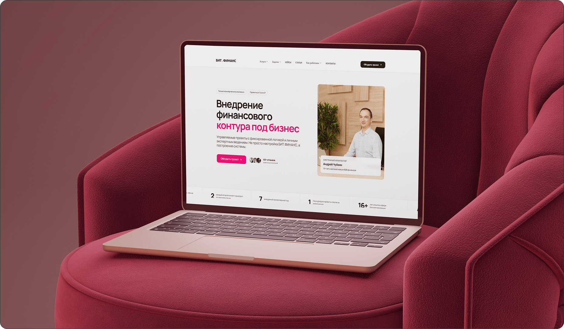
/ The client has been implementing the bit-finans.pro module for businesses for more than 12 years. He originally came to us for help with lead generation, but after analyzing competitors and his current website it became clear that the old foundation was not worth refining. It was better to rebuild it entirely into a new sales tool.

problems
Challenges We
Faced

Personal brand at company level
/ We had to build the website around the personal brand of a specific expert, but it still had to compete in feel not with private consultants, but with full companies in the niche. That demanded a stronger package of trust, scale, and proof.
Sales architecture from day one
/ The website had to be designed from the start not as a pretty business card, but as a sales tool. That meant thinking through service structure, capture points, trust logic, and the client route so everything worked toward inquiries in the very first version.
Compressed production window
/ The project had to be delivered on a compressed timeline without losing quality of presentation. Every decision had to be made quickly, but in a way that did not break future growth or turn the site into another temporary compromise.
Design
/ concept
A new standard for the niche
> We built a modern visual language with an unusual block structure so the site would not feel like another accounting or ERP page. The presentation became bolder, cleaner in hierarchy, and stronger in its sense of expertise than typical competitors.

/ trust system
Trust through the person and proof
> To strengthen trust, we relied on blocks with photos of the client, his work, and designed case studies and testimonials. The testimonials were presented not as dry text, but as videos of real clients talking about working together.

/ scale
A system for future advertising
> We designed the scaling of service and task pages for future advertising campaigns from the start. Because of that, the website works not only for the expert's current presentation, but also as a platform where new landing pages can be added without losing cohesion.

palette
Color palette
/ The palette is aligned with the real bit-finans.pro website: a white working base, neutral graphite for text, and a saturated brand magenta accent. It makes the personal brand visible without turning the site into a decorative promo screen.
/ A secondary pink tone supports soft highlights and secondary accents. It reinforces the main magenta, helps mark CTA points, and keeps the interface in a technological B2B register.
01 / White working base
02 / Neutral graphite
03 / Brand magenta
04 / Pink accent
typography
Fonts
Manrope

Headlines
Manrope gives the site a confident, current and product-level tone.
Usage
Its geometric rhythm lets large headings feel modern without becoming cold or too corporate.
It helps the expert look stronger than a typical consultant landing page.
Manrope
Body / interface
Dense service logic stays readable and clean.
Result
The same typeface keeps long-form explanations, cases, forms and landing pages consistent as the site grows under advertising traffic.
That makes the system scalable instead of decorative-only.
Manrope
Result
Dense service logic stays readable and clean.
Result
The same typeface keeps long-form explanations, cases, forms and landing pages consistent as the site grows under advertising traffic.
That makes the system scalable instead of decorative-only.
Let's discuss your project
We can improve your website so it becomes more attractive, easier to use, and more effective for business. Leave your details and let's build something strong together.